


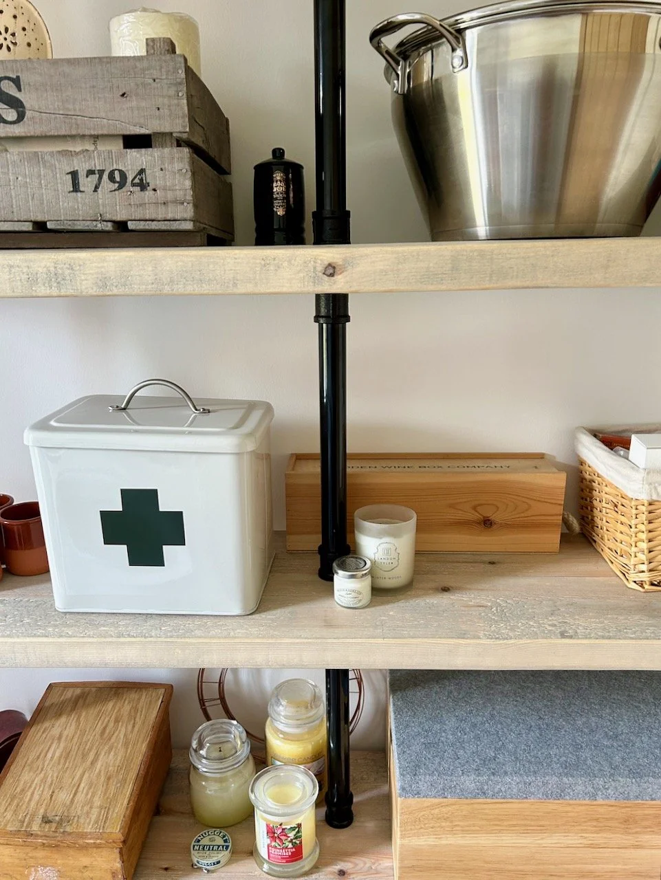


I loved the idea of these Room Sets put together by Ideal Home Magazine to show off this season's design and style trends and the best of Britain's creativity. And while I was happy to wait for MOH to arrive before wandering around the Show Homes, I decided to head over and take a peek at these before that. They're all laid out on a single level too which made it easy to wander between the rooms, I'd loved to have been able to take a closer look but looking in was almost as good. And for each room there was an A4 sheet giving all the details of wall colours through to the accessories used, which now looking back after everything's settled is very useful, and a poster alongside each room giving tips on how to get the look.
There were five room sets with each covering the main rooms we all have, or have elements of. So let's get started.
1. Indigo & Earth Living Room

To get this look:
- Paint walls in a deep blue or earthy brown
- Include timber to warm up the dark wall colour and add a natural touch
- Choose muted shades for furniture
- Add polished metal accessories to add interest and avoid the room looking overly dark.
My view:
I liked the overall look of this room with its cosy, snug feel. It's definitely one you'd want to snuggle up in on a cold day. The highlights for me were:
- This gorgeous side table by Multiyork
- The starburst mirror (shown above), also by Multiyork
But I was less keen on the molecular looking ceiling light and the textured table lamp in the foreground of the top shot - I'm not sure why, but I can imagine it would be a nightmare to dust!
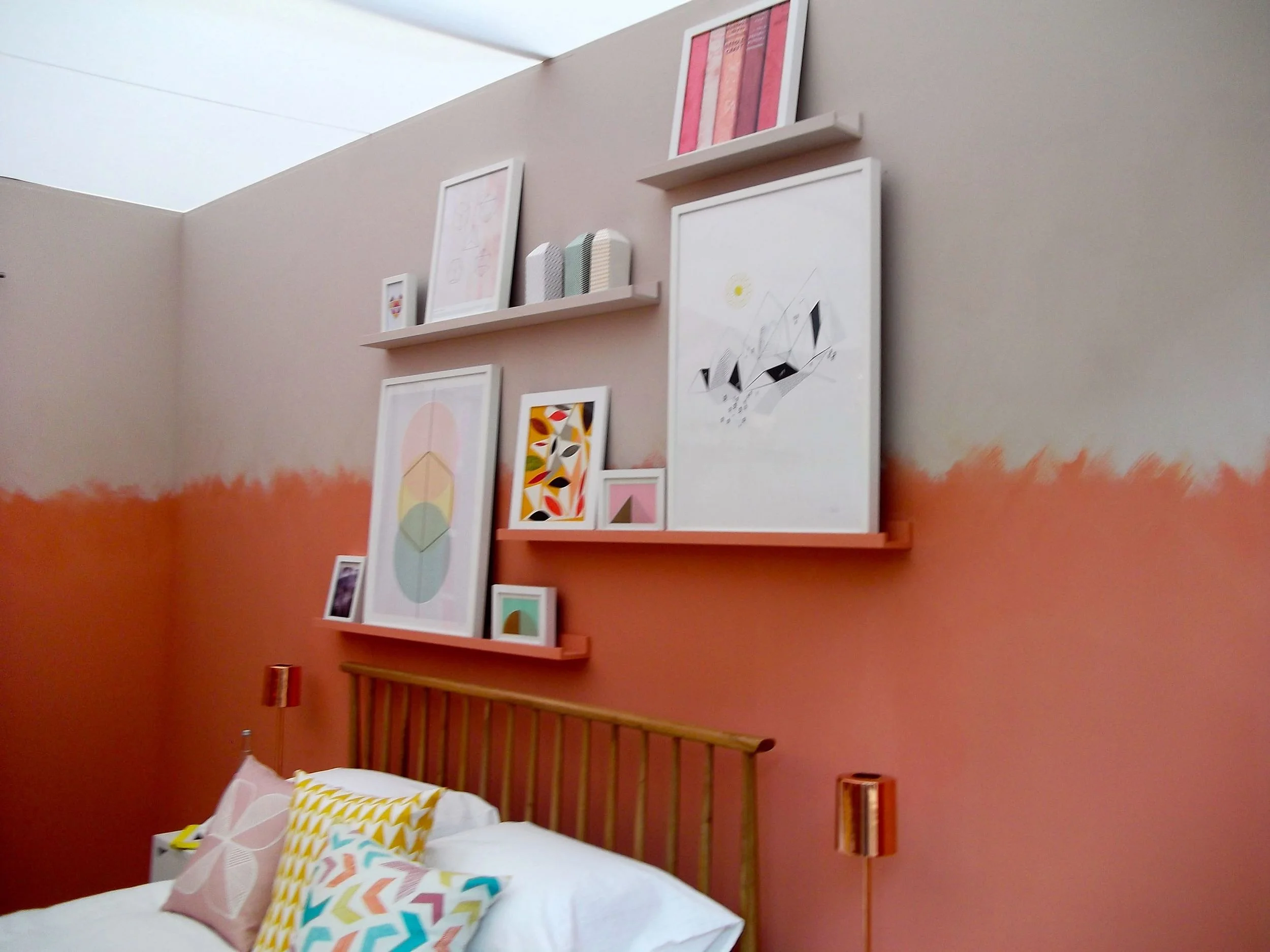
2. Copper & Clay Bedroom

How to get this look:
- Choose a warming clay pink colour for a feature wall and the lower wall sections, using a powdery pink colour for the upper sections.
- Add a neutral toned floor covering
- Add warmth with copper accessories and zig-zag patterns for interest and fun.
My view:
I was less keen on this room as I'm not a huge fan of copper. I think would be good for a teenage girl wanting a more grown-up bedroom. My highlights were
- the yellow and white zig-zag chair from Flock.
- the shelves for pictures.
I can't see this ever being a look I'd go for but I think that's partly because of the colour and the furniture - I like Danish furniture but not the Ercol styles, I think they're just a bit too 1970s for me. And I know some of you will be thinking they're a design classic, but not me.
3. Sand & Stone Bathroom
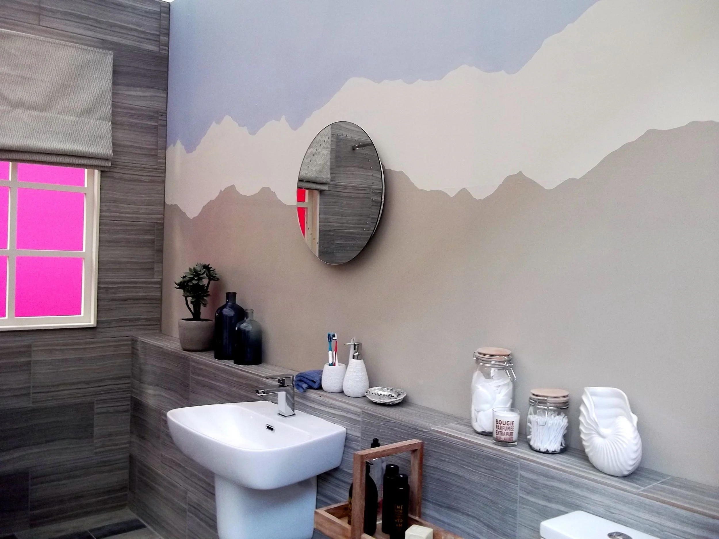
How to get this look:
- Choose a simple white bathroom suite
- Paint the walls in beach-coloured neutrals, the idea of these colours are sea-foam white, sandy beige and pebble grey
- Add pale timber effect floor coverings for a driftwood feel
- Add some luxury with marble accessories and beach-style accessories.
My view:
I wasn't keen on this room either and I didn't get that the colours were beach-y until I read the poster - I can see it more now, but to me the walls look more like mountains than a beach.

I think a white bathroom suite is always a wise choice - although I seem to be on a bit of a personal mission to rid the world of avocado (and other coloured) suites as almost every house I've moved into has had one! Note the past tense there. Although I didn't like the overall look of the room, there were a couple of things I did like:
- the inset shelves around the bath - great if you can build these into your room
- the shelf by the sink, not only great for ornaments but also for toiletries too.
4. Slate & Leaf Dining Room
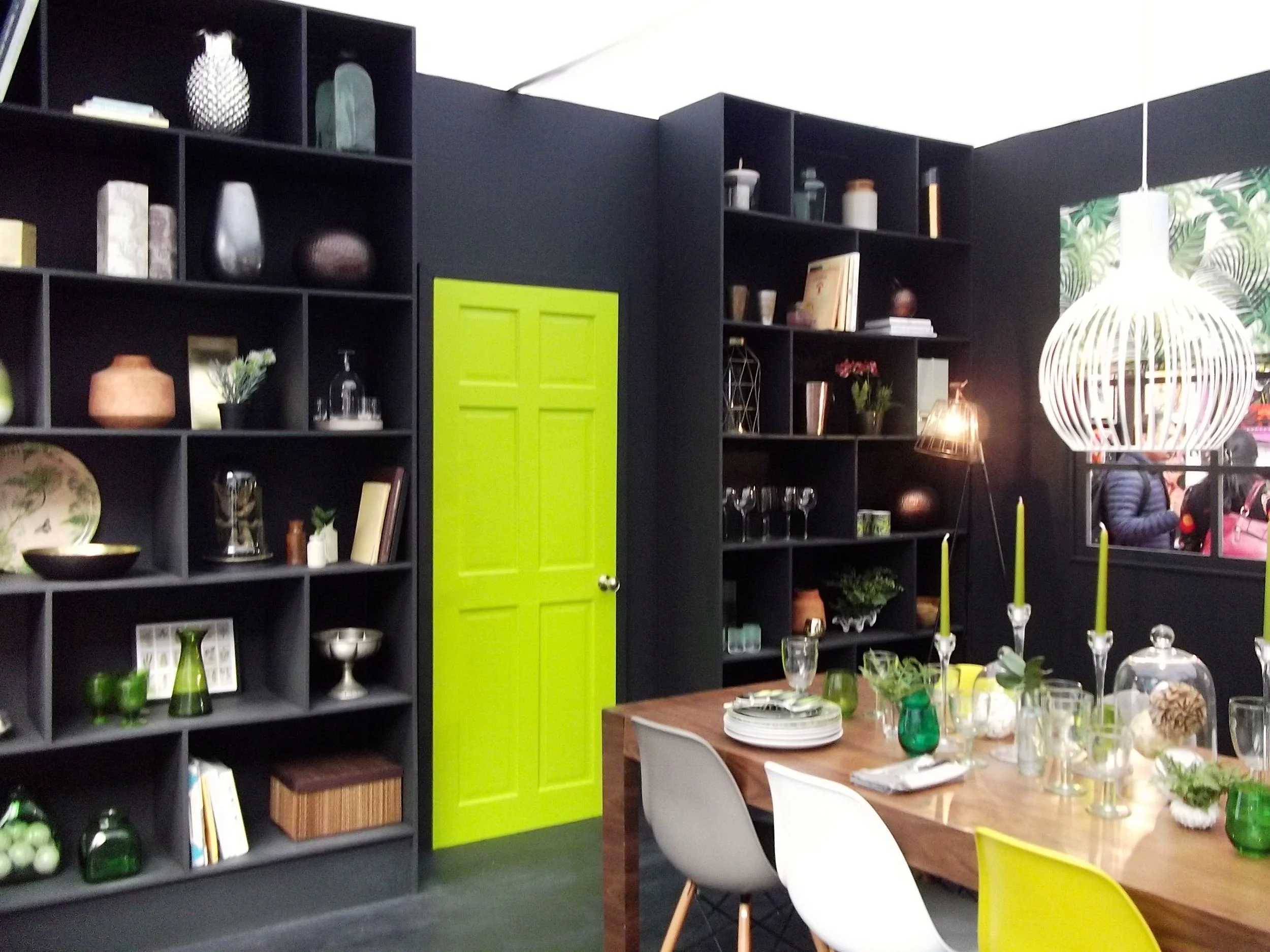

How to get this look:
- Use a dramatic charcoal colour on the walls
- Paint the door in a vivid green so it stands out
- Add a dark wood flooring to give an almost tropical feel
- Include some rich wooden furniture
- Add green throughout the room in prints and accessories and of course greenery,
My view:
This was very much my favourite room set; I loved how dramatic it was, and how vibrant too. It may be that I'm tuned into Dining Room's at the moment (remember how I fell in love with that Danish table and chairs?) but I was a big fan of this room.
Of course it won't go in my house - we have an open plan kitchen/diner and lounge, but that doesn't stop me loving it! My highlights were:
- The mix and match chairs - that's definitely something I want to replicate alongside a wooden table
- The boldness of the black and green
- The group of terrariums set in one corner on the floor.


5. Basalt & Rose Quartz Kitchen

How to get this look:
- Start with a high-gloss kitchen in a pale colour
- Add darker wood effect flooring
- Paint walls and woodwork in a gentle rose quartz and soft greys
- Keep appliances chrome or steel and add a striking splashback
- Add black wood and clay accessories for natural texture.
My view:
I'm a fan of high-gloss kitchens, and the advice we had was always look at them close up - if you can see an orange peel texture (or similar to cellulite) then it's not as good a quality as the salesperson is telling you, and ask for a price reduction!

We weren't convinced and spent a fair bit of time staring close-up at many kitchen units before we bought ours, and once you start to look you can see a difference. Trust me. Ours is champagne, which is really a fancy name for a kind of grey with sparkly bits in.
I also liked:
- the wall of high gloss cupboards, but I'm not sure I'd put a TV in the middle of them - an inbuilt coffee machine would be much more useful!
- the pendant lights over the island, but I think that's my Dining Room bent coming out again as I'm looking at those for above our replacement table too!
So five room sets, each bringing its own inspiration - whether it's all or part of the room, what's your favourite?