Reflecting on my week #77

My desk - messy but colourful

I wasn’t going to write a ‘my week’ post this week, as when I sat down it seemed that I’d be writing that it was busy at work, again. Which, while it’s true, isn’t very exciting to read, or to write.

But here I am, and although it’s late, it’s still Monday. And so I’m writing it.

We visited MOH’s family at the weekend and it was great to sit down, relax and kick back. There was good food, good wine and generally a good time. I’d forgotten my contact lens solution and case, and my thyroid tablets, but I think that says more about my working week than I care to admit.

I’d had a foot appointment during the week, which was another assessment. I left with some exercises - calf stretches, another appointment and the advice to wear trainers. That final bit of advice was a bit deflating if I’m honest, I’ve been mostly wearing trainers for the best part of a year now, and while I love my Vionic trainers which are still oh-so-comfortable, most of my wardrobe isn’t a trainer friendly wardrobe, and nor am I up for shopping for a whole new wardrobe.

I realised that I’m getting fed up of wearing trainers, fed up of wearing socks - my feet get hot and then the rest of me overheats too, and I’m fed up of wearing the same clothes. This sounds a massive whinge, and it is a bit, but it’s also partly the time of year I think. Now the nicer weather has hinted it’s around the corner I’m keen for it to be here and to shed my winter wardrobe and pull out something a bit more colourful.

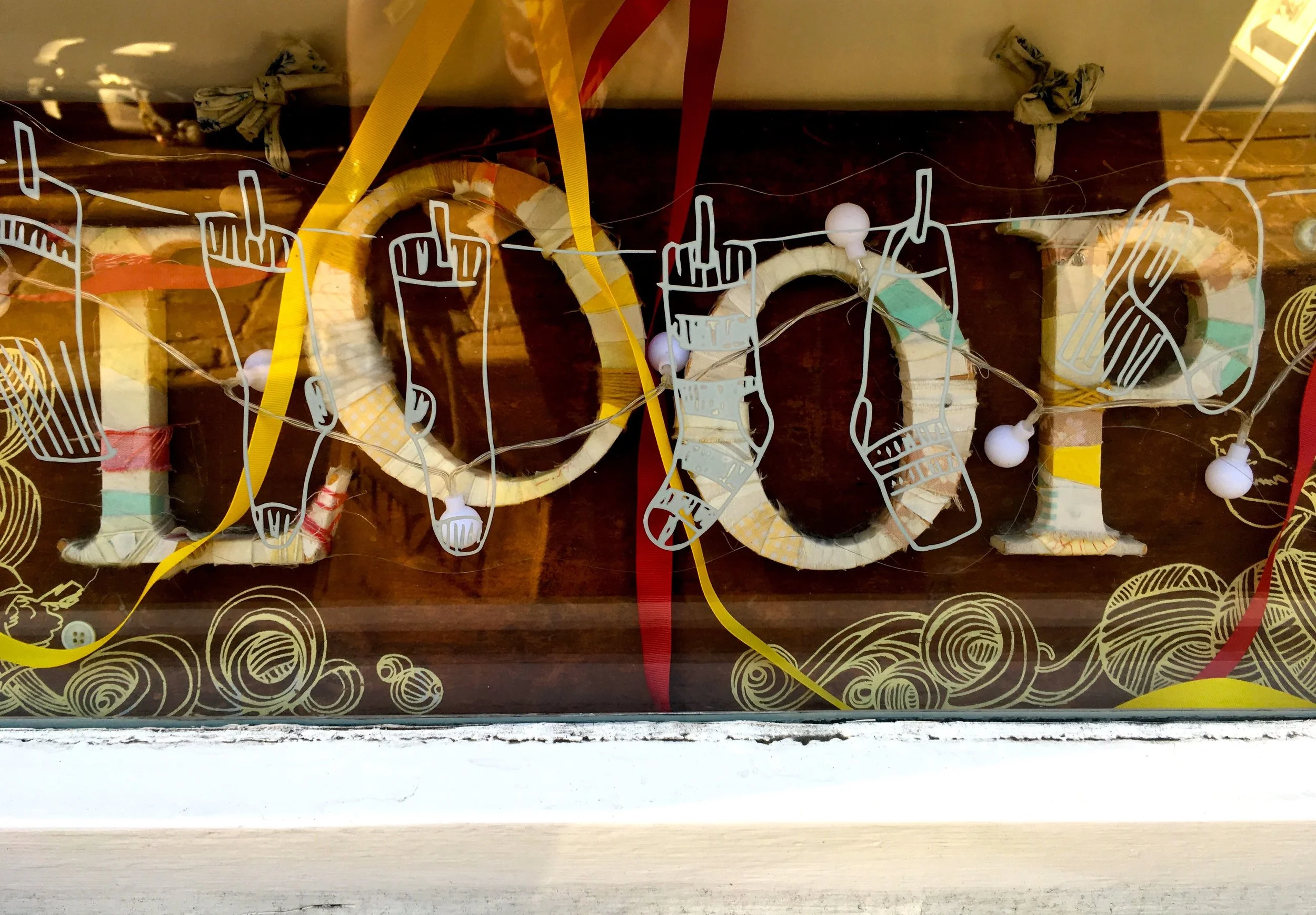
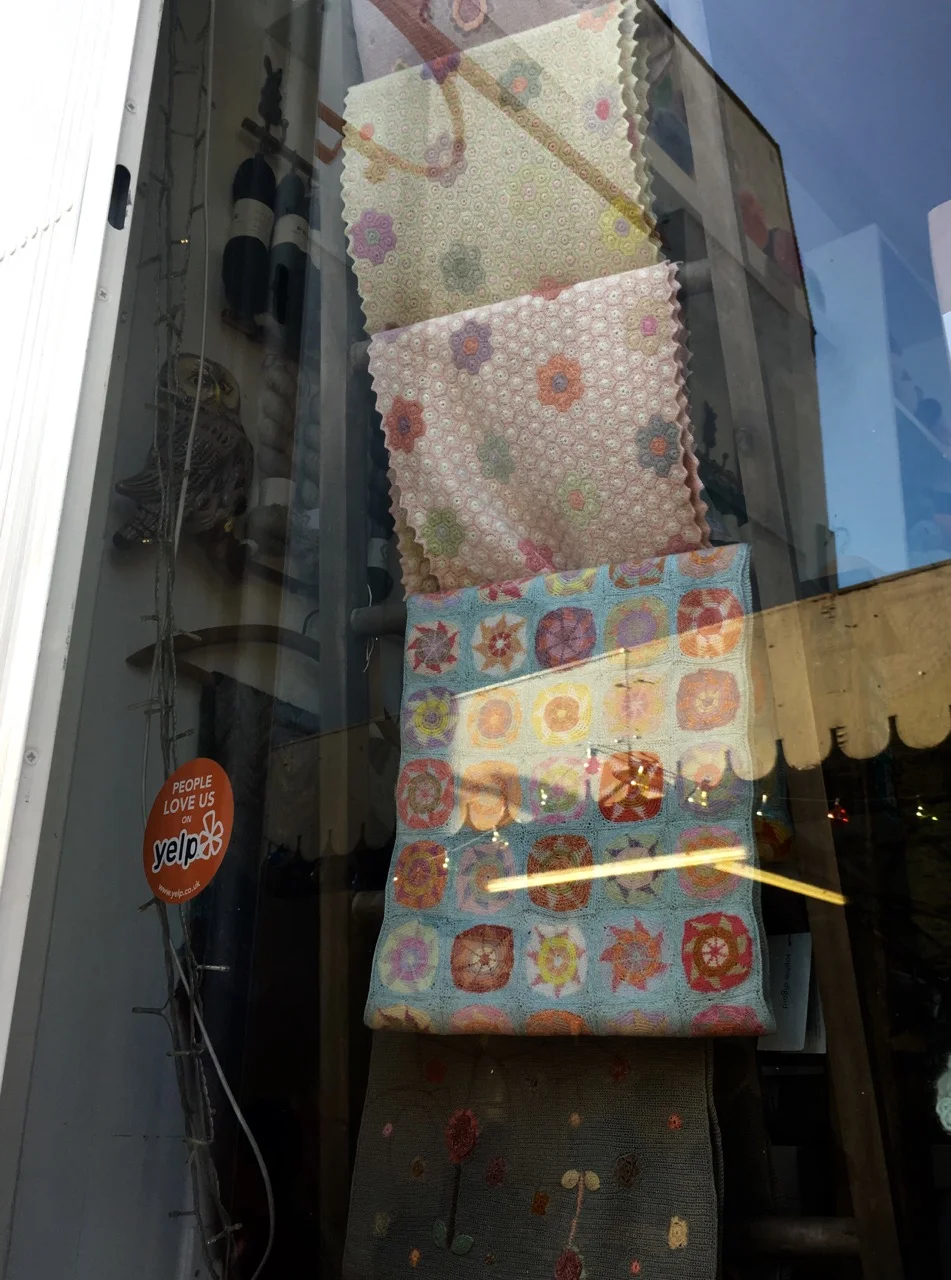
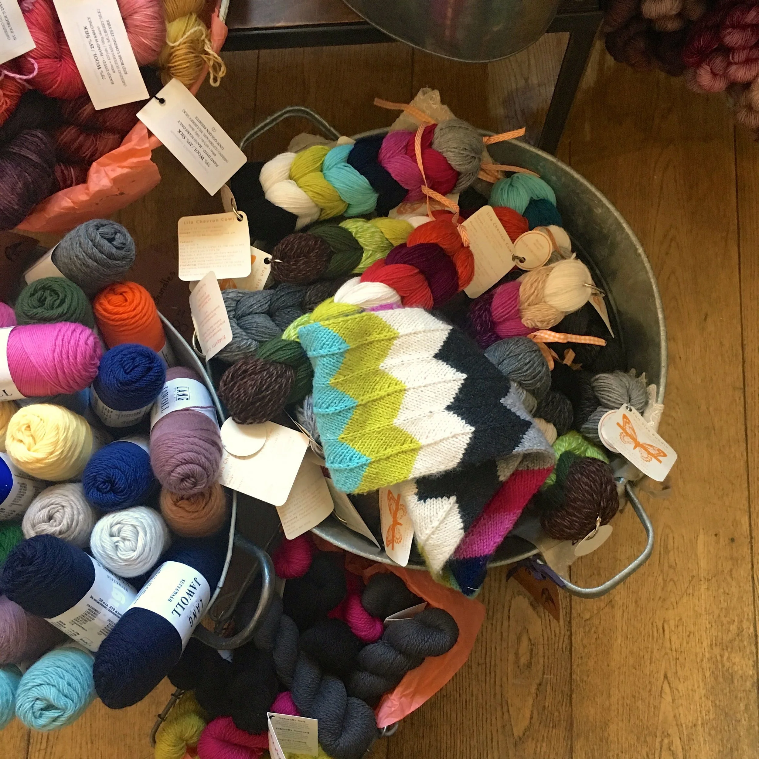
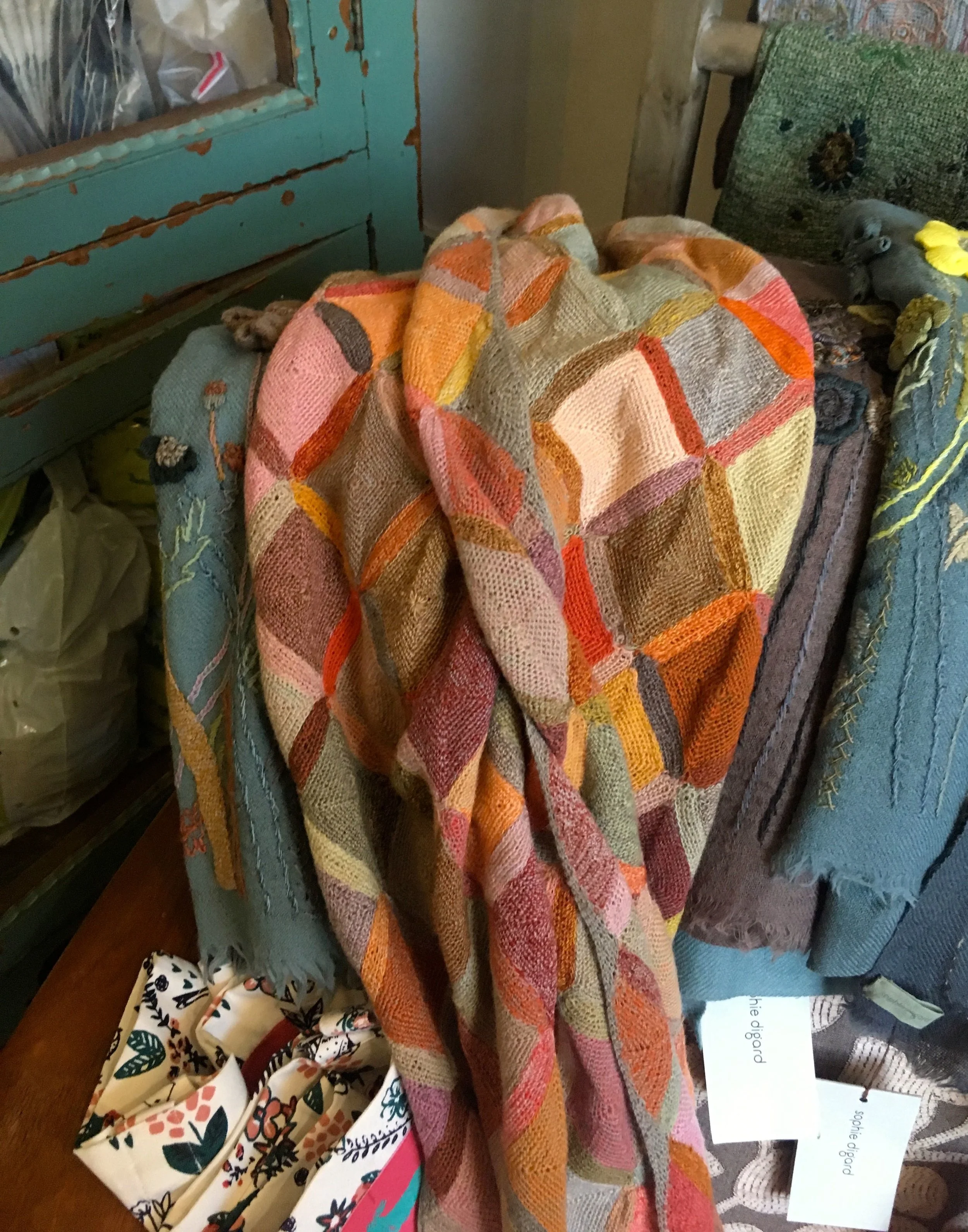
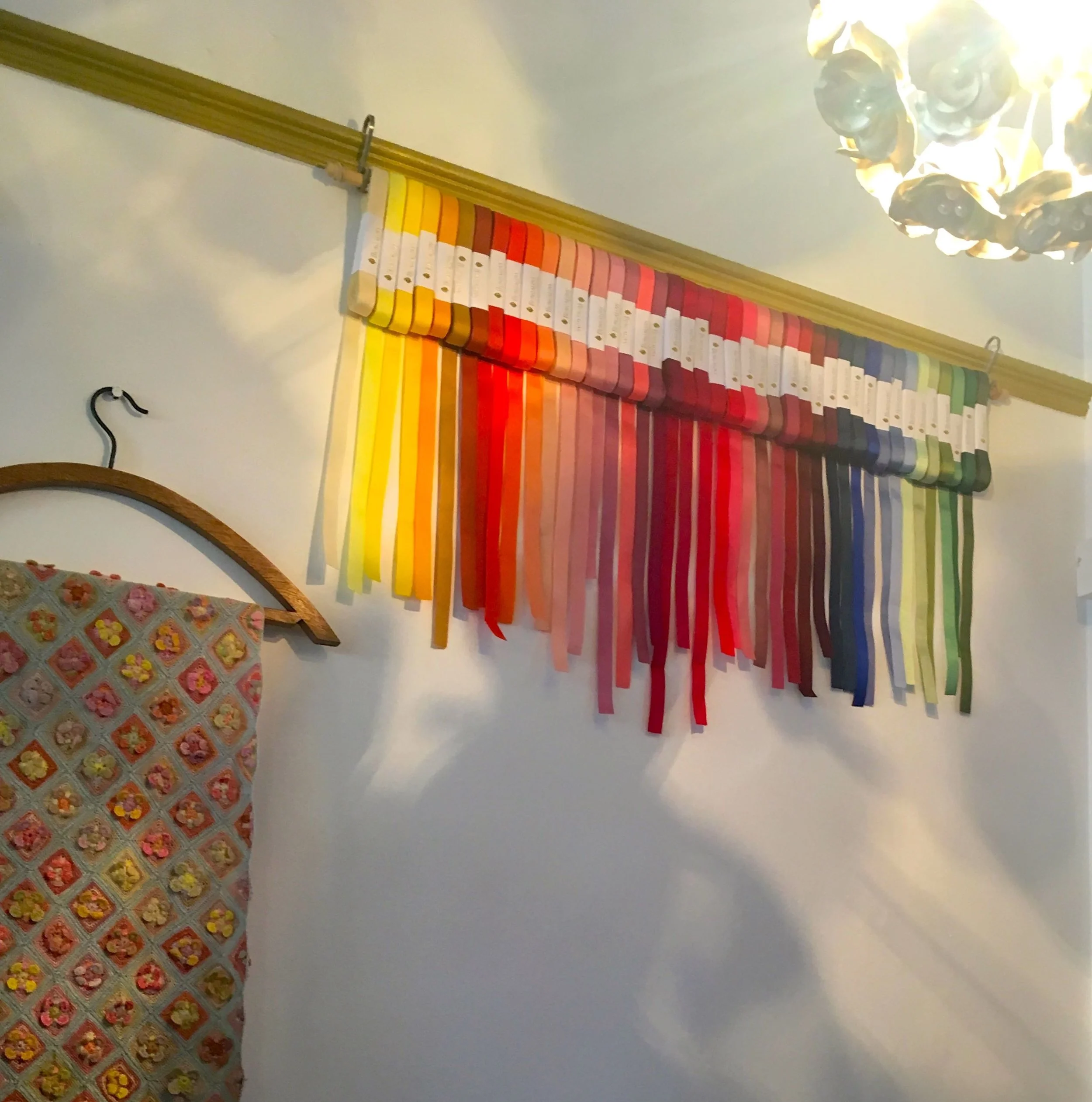
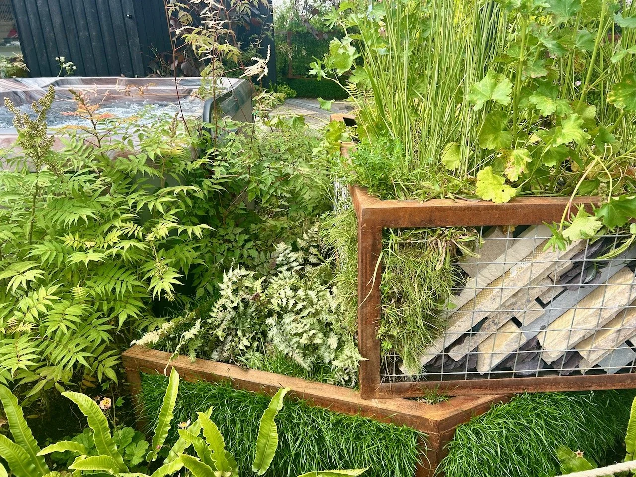
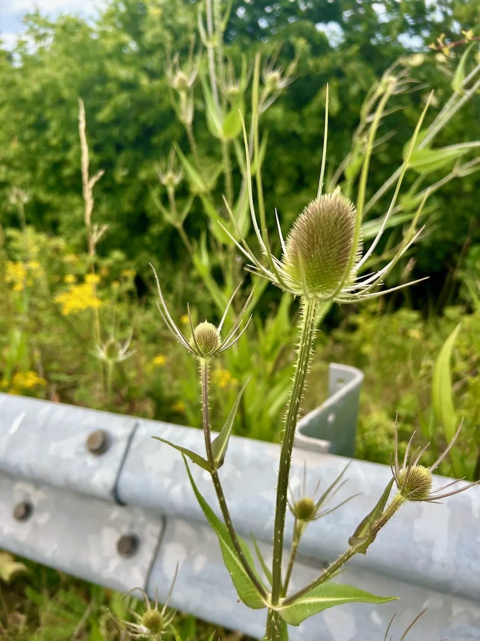
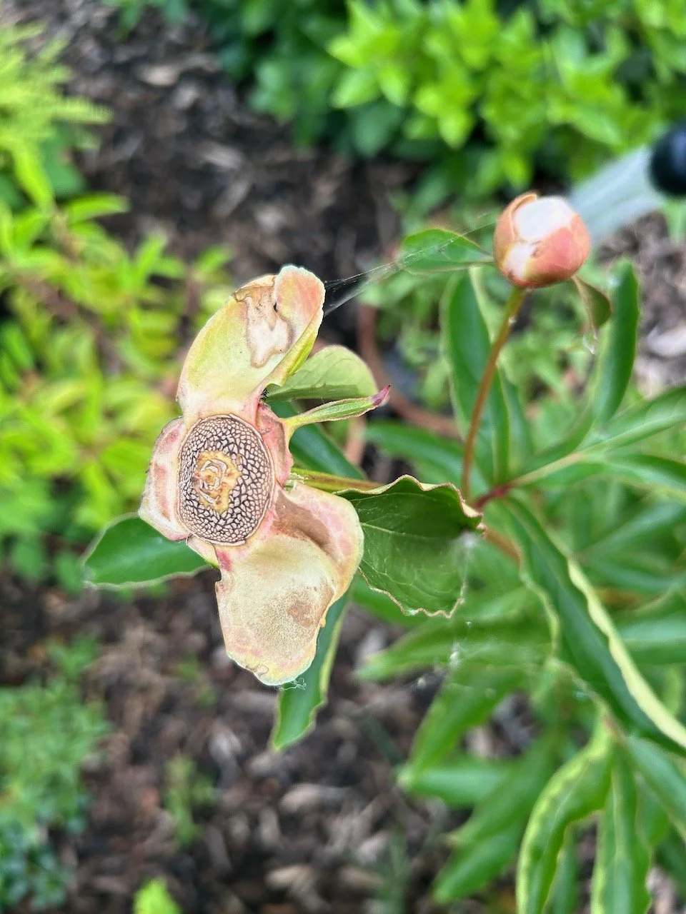
Colour has been a bit of a theme, as instead of writing this post when I sat down Sunday evening I somehow started a new gardens and gardening linky. I know, funny how at times, something what seems quite random manifests itself. You may have seen the post earlier - ‘Get creative with colour’ this April which is part of a campaign to show how gardening is good for us.

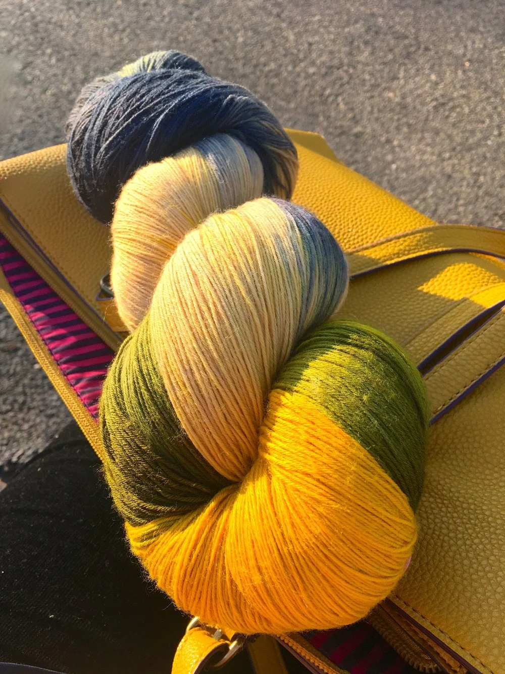
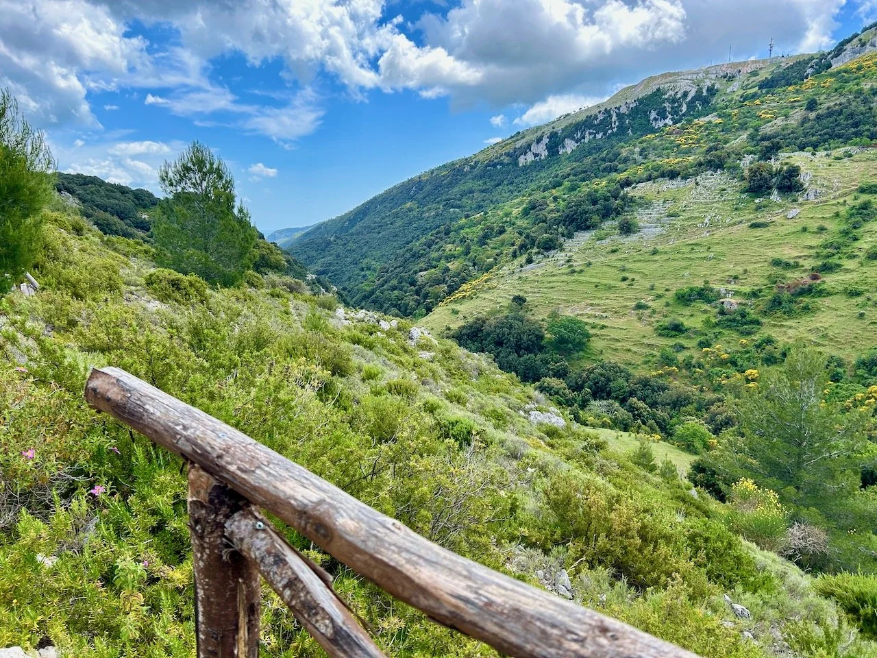
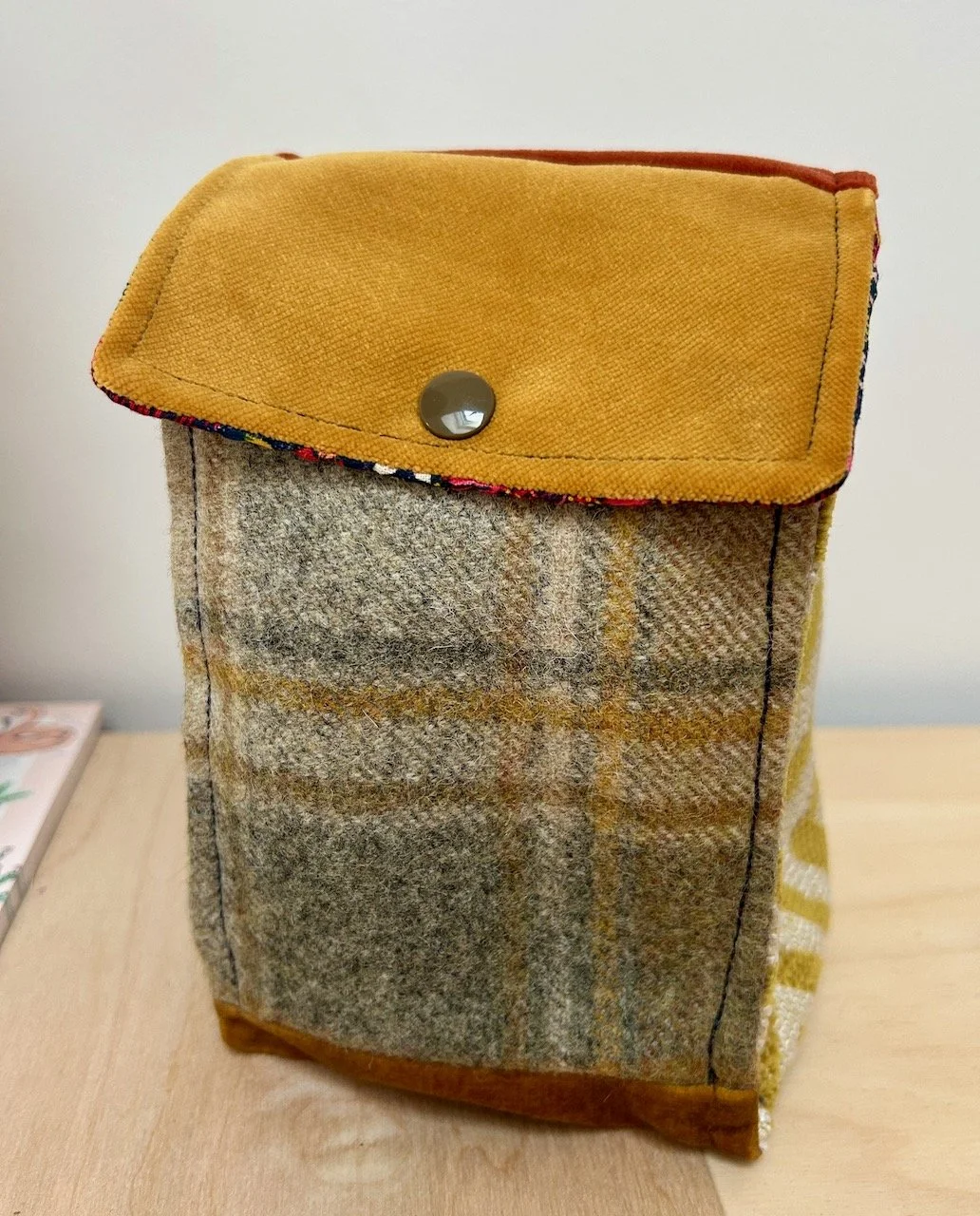
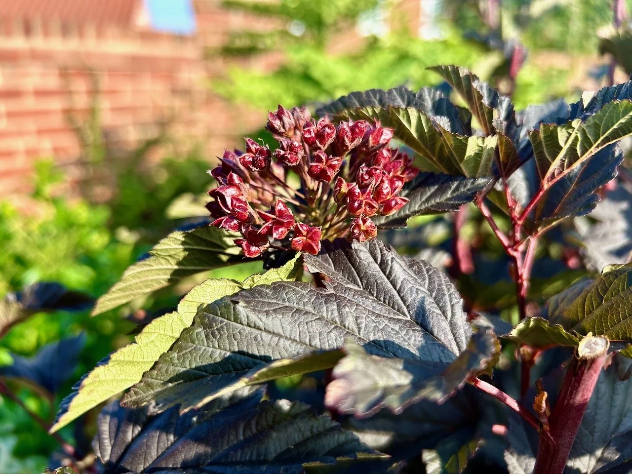
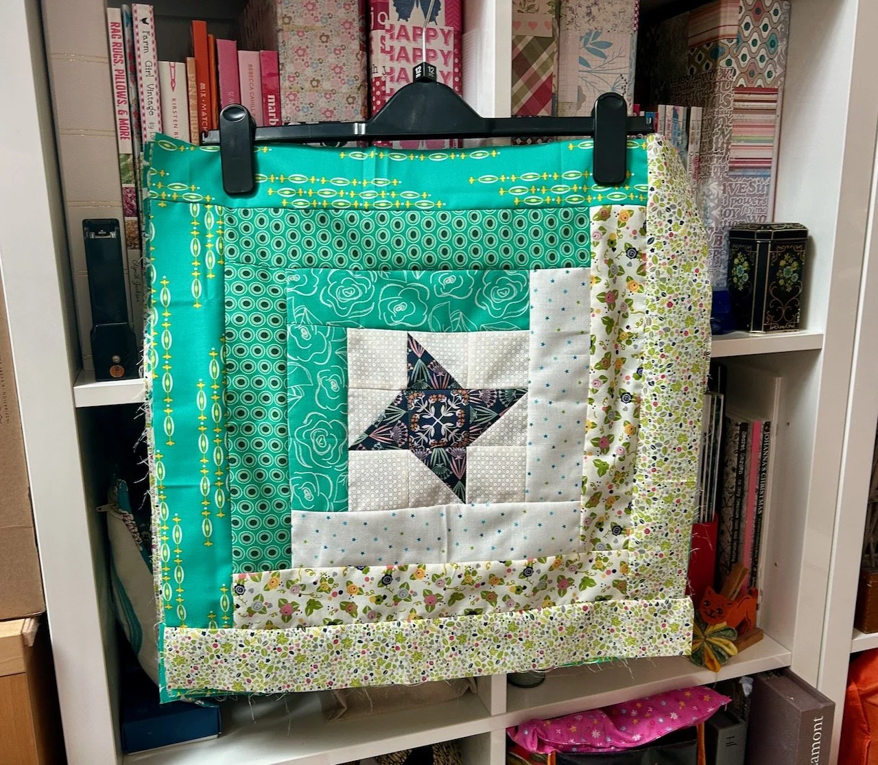
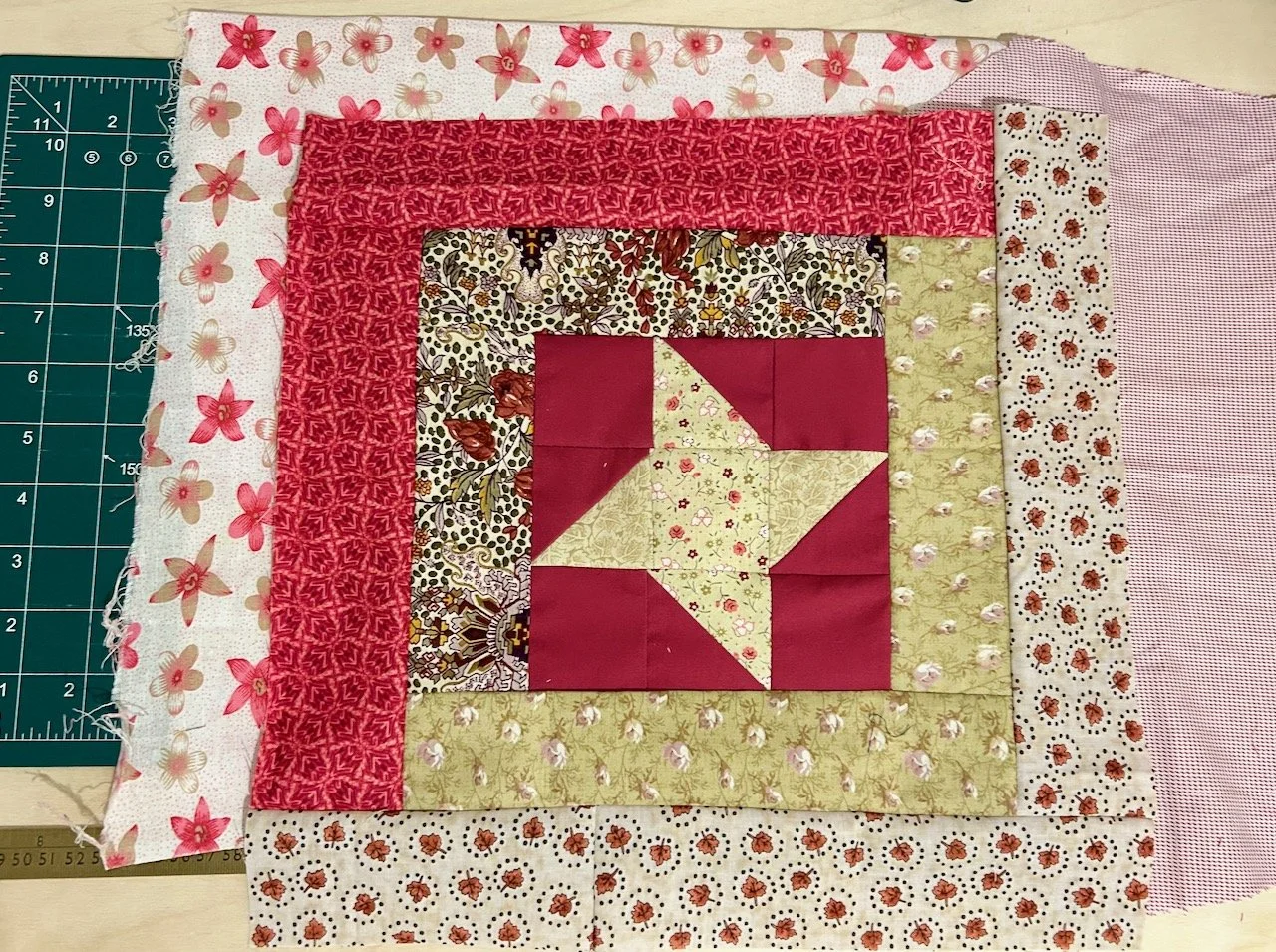
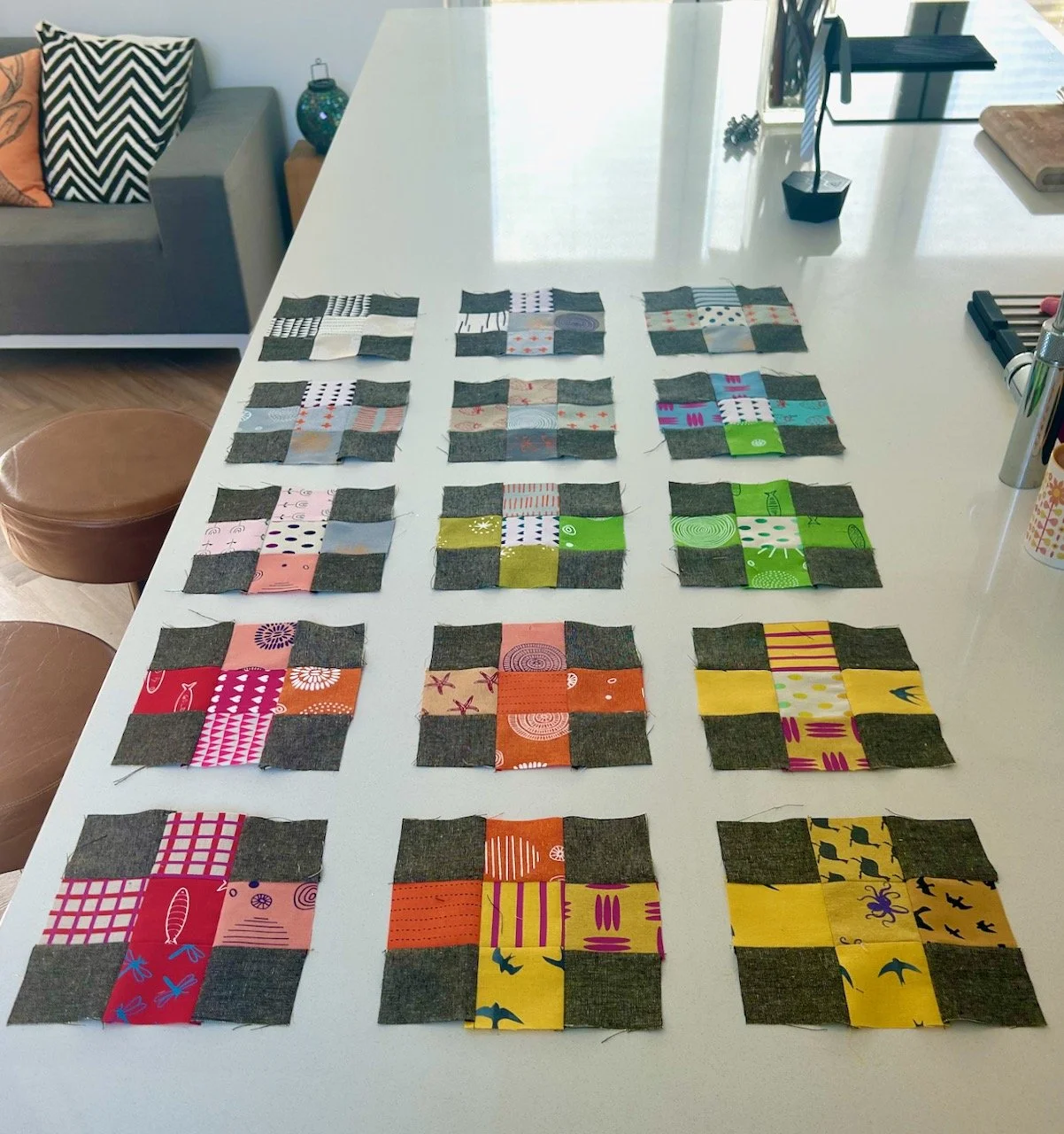
I think I just needed an injection of colour. I thought the blue skies and yellow pom-pom bushes on the way to work might do it, but not even that was enough. Mid-morning when I looked at my messy, but productive desk I realised that that too screamed out colour, and that made me smile. There’s no escaping it colour is what gives me a boost when I need it. That and some shoe shopping - I’ve another pair of trainers, that have a bit of bling, on the way.

I’ve also been suffering with aching hips this week, so much so that alongside working later than I planned to and life generally, I’ve now missed a week of my new exercise routine, which doesn’t fill me with joy either. Through monitoring when they ache I’ve learnt it’s not related to my foot issue, it doesn’t hurt any more or any less if I adjust how far I walk, but they can feel better if I sit with my feet up. That was something I discovered quite by mistake in the reclining sofas which my SIL has. That means I’m off to the doctors again this week to see if those blood tests showed anything, and to see if there’s anything more on what the joint pain might be.

If not I think I’ll be in the market for a pouffe that I can put my feet up on!

'Get creative with colour' this April

Gardening is good for you, that’s the message from the Horticultural Trades Association (HTA) who have a year long campaign to persuade more of us to get out into our gardens, to enjoy our spaces and perhaps perk them up a bit too. 

I can’t quite believe it’s April already, the year seems to be running away with us.  In my own garden I’ve hardly made it out there much yet and I’m not quite sure why.  I suspect partly it’s due to the weather - it has been lovely the last couple of weekends, but we’ve been out and about so it’s also partly down to weekend plans.  Unusually I don’t have any seeds sown yet either, but I also know with my north-facing garden, which takes a little longer to warm up, that I should be ok as long as I get started soon.

And because I also believe that gardening is good for us I’m planning to share more of the #GIGFY campaign for the rest of the year.  So, on the first of every month, pop back and see the theme for the month and how they promote gardening, health and wellbeing activities.  Every month I’ll also host a linkup where you can share your gardens and/or gardening posts (old or new) that complement the month’s theme.  For April, that’s Get Creative with Colour.

APRIL: GET CREATIVE WITH COLOUR

APRIL: GET CREATIVE WITH COLOUR

Using colour in your garden

You’ll know I’m an advocate of colour, and so this is the perfect month for me to start sharing the ‘gardening is good for you’ with its colourful theme.  I’d like to say I planned it like this, but I didn’t - I only learnt about this at the Garden Media event I went to at the end of February...

Using colour in your garden is as easy as using colour in your house. It’s that simple, although you’ll also know I think we can play it too safe with our interiors choices. So if that’s you, then going a bit wild with colour in your garden is the perfect way to rebel. I mean, have you seen some of the colour clashes that nature puts together, and which just work?

For somewhere bright and uplifting choose a colour palette with red, gold, yellow and orange – all colours with energy and warmth. Planted in bold bocks around a patio, and matched with furniture in equally uplifting colours, they’ll produce a joyful place socialise outside.

In contrast, create somewhere calm and relaxing using cool colours like blue, mauve and violet, set against a backdrop of green, and perhaps adding pure white and silver for a clean, tranquil effect. With soft chairs to sink down into you’ll create a peaceful and restorative space to sit out and meditate.

Different colours can influence on your emotions in different ways:

  • Red: bold, bright and stimulating, exciting and eye-catching

  • Orange: warm and vibrant, happy and fun

  • Yellow: cheerful and welcoming, positive and stimulating

  • Green: fresh, natural and calming, peaceful and relaxing

  • Blue: simple, cool, calming and relaxing

  • Purple: striking, powerful and energetic

  • White, grey & silver: pure and simple, clean and classic.

Colour can influence your visual perception of space

By growing bright red plants at the end of a long, narrow garden you can make it appear closer than it actually is, while cool, blue flowers will look further away, giving the impression that the space is larger. Vibrant colours like red and yellow grab your attention, drawing the eye away from eyesores or views you’d prefer to ignore, while pure white and gold shine out on dull days and brighten a shaded spot.

Choosing colour themed displays

You can have fun with colourful groupings or partners, and good planting companions include:

  • Purple and yellow or gold, such as Geranium, Achillea, Rudbeckia.

  • Red, yellow and blue, such as Solidago, Scabious, Camassia, Scilla peruviana.

  • Purple, green and orange, such as Geum, Alchemilla, Campanula, Erysimum, Salvia, Verbascum, Hosta, Euphorbia, Bergenia.

Dont worry about the ‘proper’ names of the plants, a quick look around your garden centre or on the internet will quickly determine what they look like and if you like them. Like other parts of your home, if you don’t truly love it then you shouldn’t include it.

You can find our more about colour therapy in garden design and learn the basics of colour theory to know what looks good using the appropriate link.

Gardens to visit for: colour-themed inspiration

Despite two of these gardens being relatively close and/or close to family, I’ve not visited any of these, so it seems This month would be a good time to put right!  If you’ve visited any of these gardens I’d be keen to see your posts linked below, alongside any that complement the theme.

“TheGardenYear

You are invited to the Inlinkz link party!

Click here to enter

Truly awesome creations

Just next door to Smug is Loop, and if I thought Smug was a dangerous enough shop, then Loop takes that and doubles it. Its website tagline of “Gorgeous knitting supplies” does not lie. And their shop window is one that intrigues, delights and draws you in through the peculiarly small double shop doors.

Loop Islington Shop Window
EXQUISITE CREATIONS IN THE SHOP WINDOW, I HAD TO GO IN

EXQUISITE CREATIONS IN THE SHOP WINDOW, I HAD TO GO IN

Having spent the day at the Garden Media event and collecting goodies along the way, I arrived in the shop through the original half size doors none too elegantly. I’m sure I’m not the only one that makes such an arrival!

Once in the shop I was mesmerised. So many lovely colours, so much gorgeous wool. It was hard to know where to start. And once I’d worked that out, I learnt there was an upstairs too, and I really was smitten.

BASKETS OF WOOL
WOOL FOR SOCKS AT LOOP LONDON

Throughout the shop there were the most exquisite and awesome creations, which inspired and wowed as well as slightly scaring me at the same time. The level of work is stunning, and the throws were the perfect way to show off what’s possible.

THROWS IN AUTUMN COLOURS
THROWS WITH FLOWERS AND HEXIES.jpg

Just like their neighbour they are masters of the display, I mean a rainbow of ribbons by the till. It seems almost criminal for anyone to buy anything quite so pretty.

A RAINBOW  OF RIBBONS

But this was the shop I cracked in, I knew that I would leave with some wool. It was just a matter of which, and how much. And if I’d manage to get out of those doors again. You might remember that gorgeous wool I wound a few weeks back, yes it was here that it came from. If you’re wondering what’s happening with that, then I’m currently in a bit of a dilemma, but more on that another day.

In the meantime here’s a reminder of how gorgeous it was.

Beautiful+wool+-+the+colour+is+Aspen+Tree.jpeg

Sigh. So much gorgeousness. Let’s hope I can do justice to my own piece of gorgeousness.