Zoe Murphy: Loving what belongs to you

I’m continuing my 2016-fest today with a few photos from my visit to the London Design Festival, where I took these photos of Zoe Murphy, a young designer’s work. I’ve realised that I’m quite a fan of mid-century furniture, especially when it’s had a bit of attention and brought up to date.

In its original state I can admire the furniture, but it’s when it has either simple colour blocking like the unit in our Porto apartment, or the bold designs at this year’s Grand Designs Live. Zoe pieces take a similar approach, but there’s much more detail and colour. She says she takes her inspiration from her seaside hometown of Margate.

Zoe Murphy London Design Festival 2016

She also promotes the idea of ‘loving what belongs to you’ using the shapes and textures inspired by her home town to decorate the furniture, none more so evident than the buildings in the table below.

upcycled furniture by zoe murphy
zoe murphy - loving what belongs to you

What do you think? Are you a fan, or do you prefer your mid-century modern furniture unadorned?

Silken pottery

It’s been quiet on here the past week or so, and that’s because I’ve been on a bit of a mission and something had to give. Turns out it was this space which I love, but now the mission is mostly accomplished I’m expecting to catch up with myself, or a least a bit more than i have recently. The mission - more on that on Monday, as it really is quite dull - involved photos and this post is as a direct result of some of the photos I’ve rediscovered.

Some like these, I intended to share here but somehow never got around to it, and others I’ve wondered why I’ve kept, if not why i even took in the first place. But that’s the joys of digital photography, I guess, though I’m pretty sure I’ve some actual photos that fit into the same category!

But anyway, back to today’s post. These photos are shamefully from 2016 and my visit to the London Design Festival, and they are amazing. Well, not the photos, the content.

fragments of pottery covered in silk and sewn together to create pieces of art

They are fragments of pottery covered in silk, and then put together again to reform the original item, or part of the item. And they are exquisite.

brightly coloured materials, exquisite craftwork and a beautiful result

It’s not so obvious with the items above, but the photo below shows the amount of work, and very neat stitching, to cover each fragment. The items fit together again so well, as they’re broken specially to create these beautiful pieces.

An exquisitely created and decorative bowl
the bowl side on
pale lilac flowers and patterned material mixed together

I know that I was totally mesmerised by these, and we spent quite a while speaking to the creator of these. Sadly though, along the way and over the years, I’ve mislaid (or not found again yet) the details of the maker. I wish I had them to hand, because all this time on I still think they’re great, and knowing this now, I’d happily part with some cash (and no doubt a fair amount of it) to own one of these.

Love This #73: Sandberg's Swedish Wallpaper Art

It's been a while since the London Design Festival took place, and this year I headed over to the London Design Fair in creative heart of East London. The fair included what has previously been known as Tent London and Super Brands London and was held in the Old Truman Brewery. The building itself is fascinating and I'm sure you'll spot it in future posts, and it's likely it will have its own post too. 

But before we get to that I want to share more about this Swedish wallpaper company, who I saw quite early on. But I was so keen on one of their wallpapers that I carried a sample of it around for the rest of the day. MOH was worried I think because he could see how taken with it I was, and because he knew we had nowhere suitable for it. I knew that too, but I also knew I wasn't leaving without a sample, even if I'm banking the wallpaper for a future project and house.

But it was this wallpaper that caught my eye and drew me over to the Sandberg stand.

SANDBERG SIGNATUR WALLPAPER: VÅRA VISOR

SANDBERG SIGNATUR WALLPAPER: VÅRA VISOR

The yellow version of the wallpaper inspired by the songbook ”Våra visor” with the sort of pattern that the more you look at, the more you see. MOH wasn't keen on this one, but I could see this working in either a child's room or a playful part of the house. 

While looking at the yellow and grey Våra visor I couldn't help but notice the wallpaper that captured my heart, and that's this striking and boldly patterned wallpaper. While it has yellow in it, I wouldn't look at this and say it's yellow and that troubled me, as I rarely go for blue. The lady said it came in a yellow colourway and briefly wondered which room we'd redecorate to accommodate it. 

SANDBERG WALLPAPER: TISTLAR BLUE 

SANDBERG WALLPAPER: TISTLAR BLUE 

But when I found the yellow version I was disappointed, it was more lemon than bold yellow as I'd hoped and the plans to redecorate where immediately shelved. There's a red version which was back in the bold range, but not for me. Which left the blue which had caught my attention, and that I was unable to stop looking at.

SANDBERG WALLPAPER: TISTLAR YELLOW

SANDBERG WALLPAPER: TISTLAR YELLOW

SANDBERG WALLPAPER: TISTLAR RED

SANDBERG WALLPAPER: TISTLAR RED

SANDBERG WALLPAPER: TISTLAR BLUE

SANDBERG WALLPAPER: TISTLAR BLUE

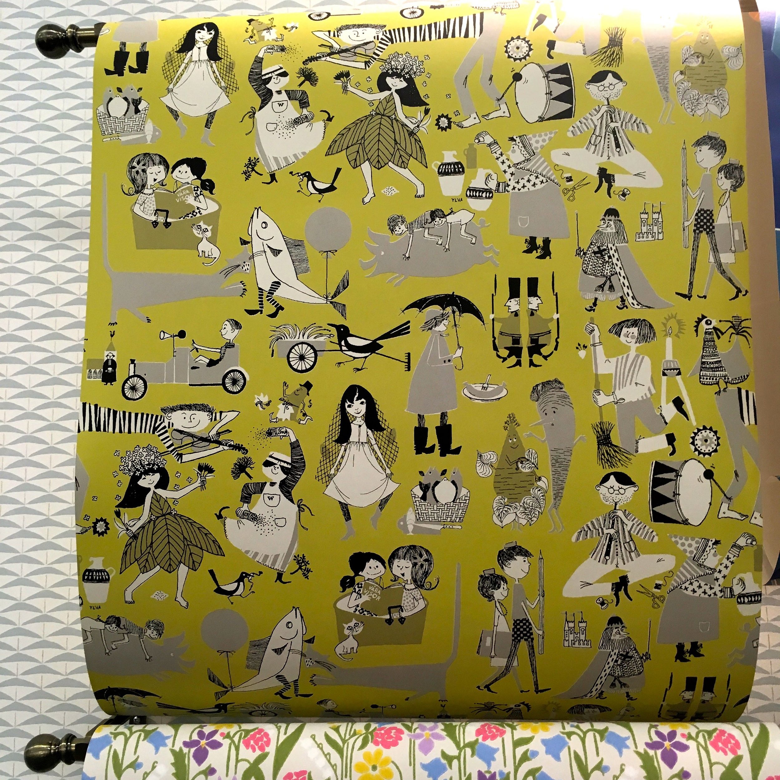
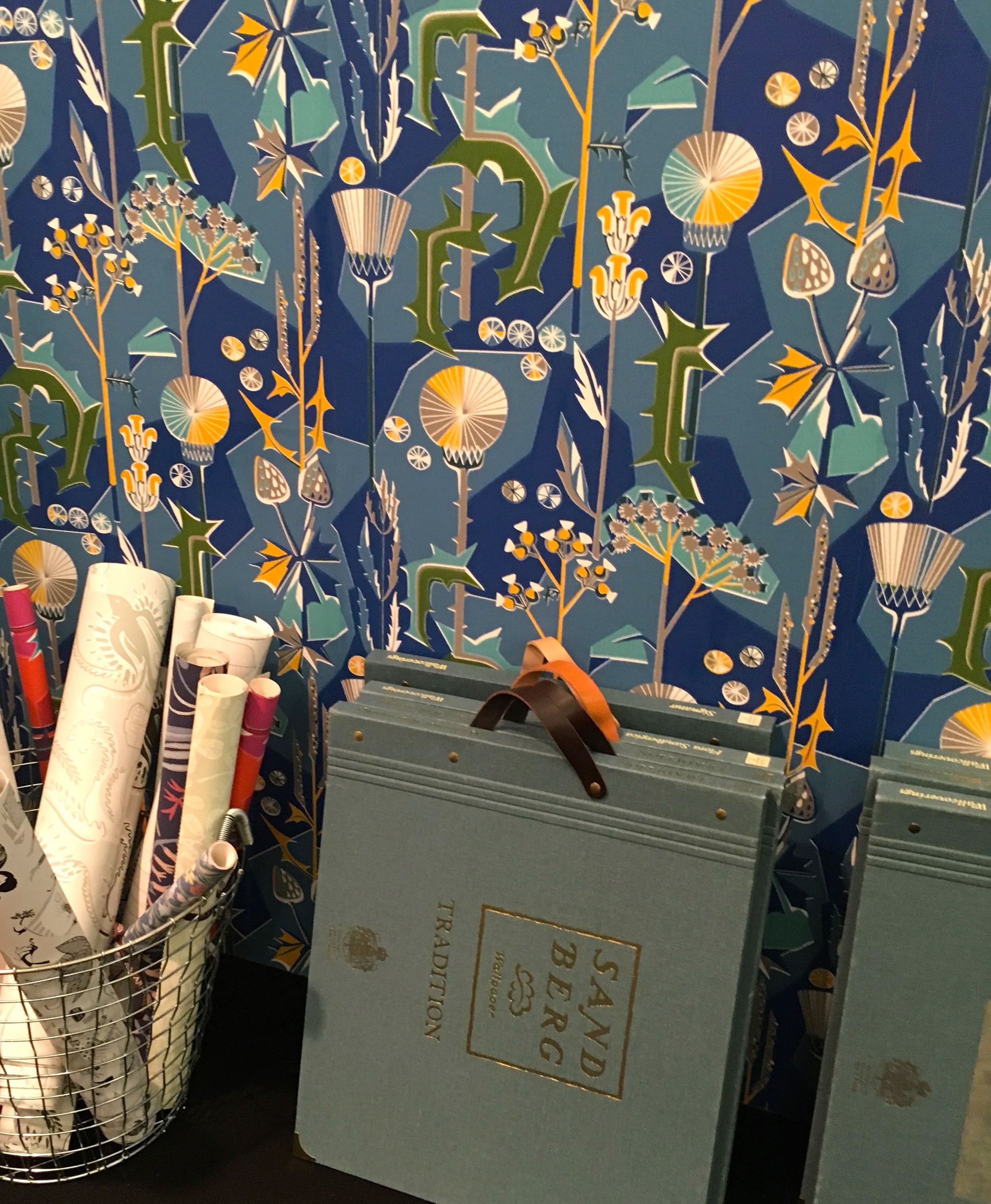
I've decided that for me the pattern is thistles and that's some of the attraction, along with the bold lines and colours. I've since read that the lines have been softened, and more worryingly that the blue is also available in a fabric. At the moment, having this somewhere at some point is inevitable, but I just don't know when or where.

I'm hoping that the sample which I left clutching goes some way to fill the need for this pattern, that I didn't know existed. That's not going to wallpaper me anything, it might just about cover a book - remember those days when you used to cover your schoolbooks in wallpaper? - yes, me too.  I do have a plan for it and that's as part of a craft project that's underway at the moment. My challenge there is to use enough of the wallpaper to capture the elements I like, but to save enough so I'm not without it. 

Although I guess I could send for another sample if it comes to it. 

When I looked at the Sandberg site to check the names of the wallpapers I've shown here I found myself browsing the site and finding lots more boldly patterned wallpapers and some more subtle ones too. But the thing that I liked the most was the Sandberg wallpaper personality quiz.

I've taken it twice now, on different days, and both times it's made me a Nowstalgic, and both times the Tistlar wallpaper has been shown in the results (admittedly the red version) but that confirms my feeling of inevitability, doesn't it?

Apparently as a Nowstalgic I love "products and patterns that have stood the test of time" and enjoy exploring new techniques that fit in with "relaxed and aged style of the home." That feels right, it also says that auction sites and flea markets are a favourite, that's not so true. But it is true that items featuring favourite colours become must-haves, and the bit about mixing my finds with teak furniture is also partly true. Of course, it's quite general but at least some of it rang true.  

What's your wallpaper personality type?  Take the quiz and let me know in the comments.