


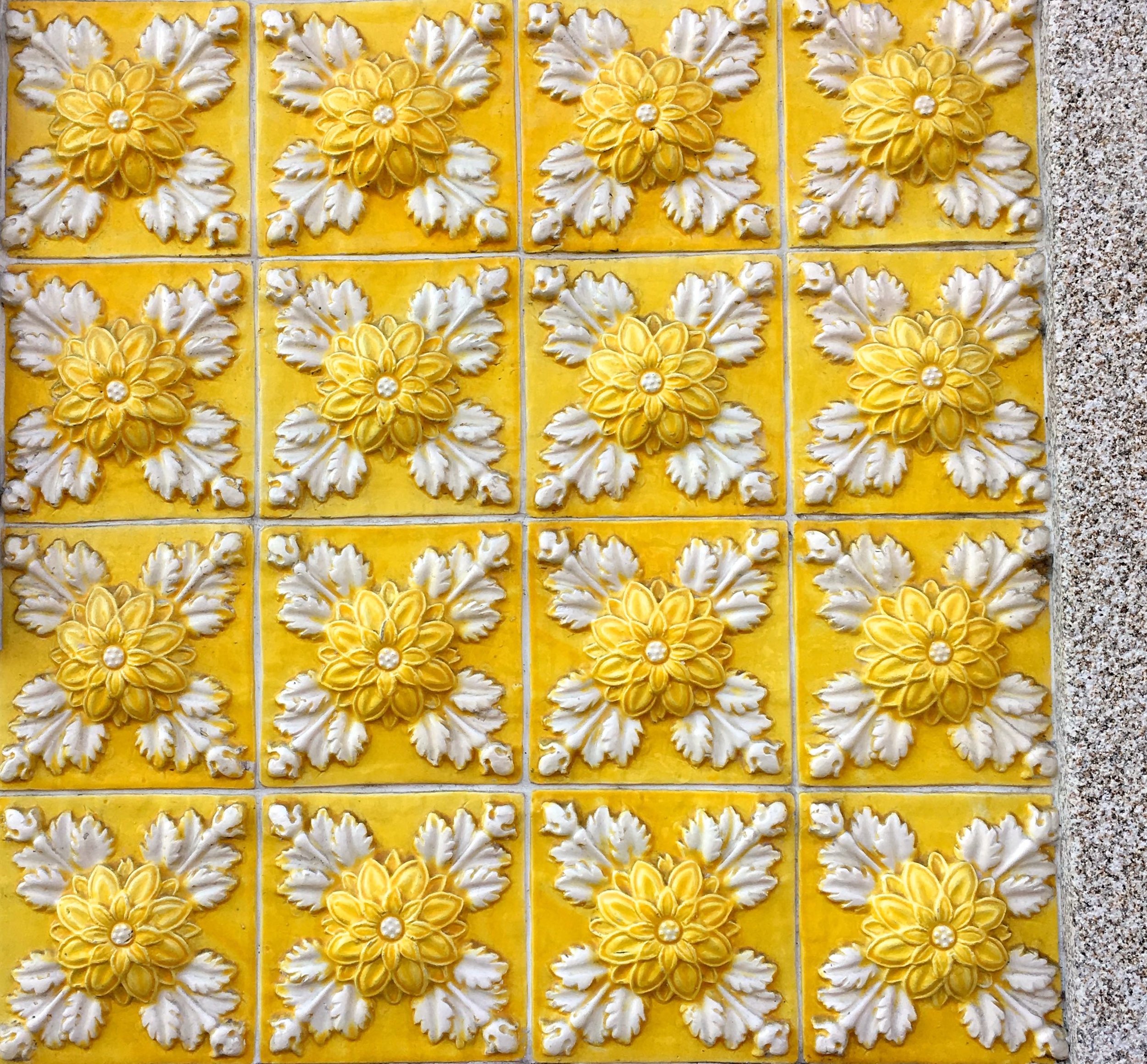
It was the patterns of the tiles in Porto that I found myself fascinated by. Whether it was the 3D-type, like the ones below, or the intricate almost Moorish designs. I found myself seeking out the tiles as we walked around the city, and mostly my phone was out ready to snap their delights.

Bright yellows and faded yellows, the tiles were inset into many of the buildings. Some bold, some delicate, but all very pretty.
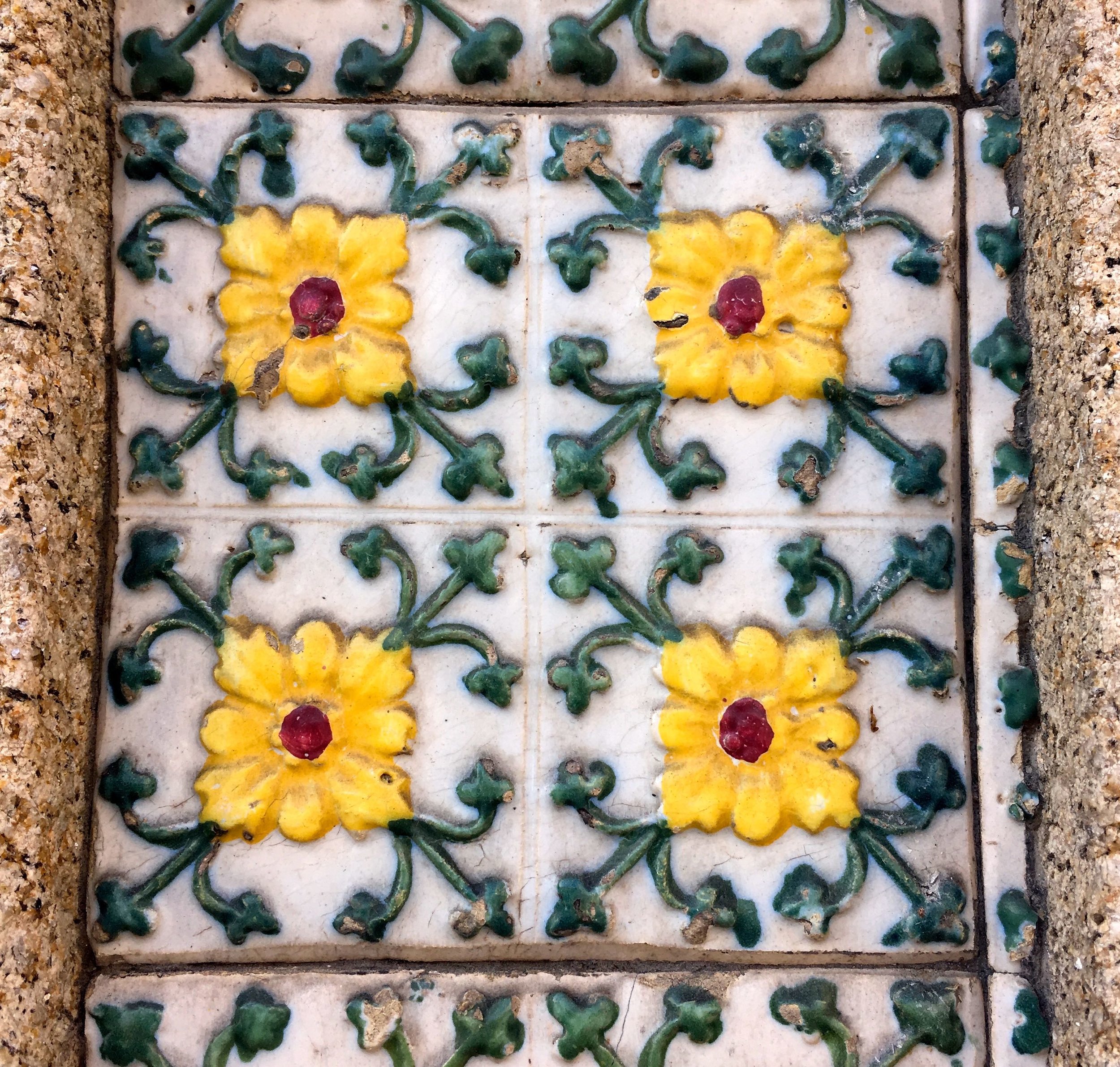
And variations on a theme. These are different to the ones at the top - the flower is slightly different - it took me a while to confirm that, I couldn't decide if it was just the layers of paint that made them feel different.
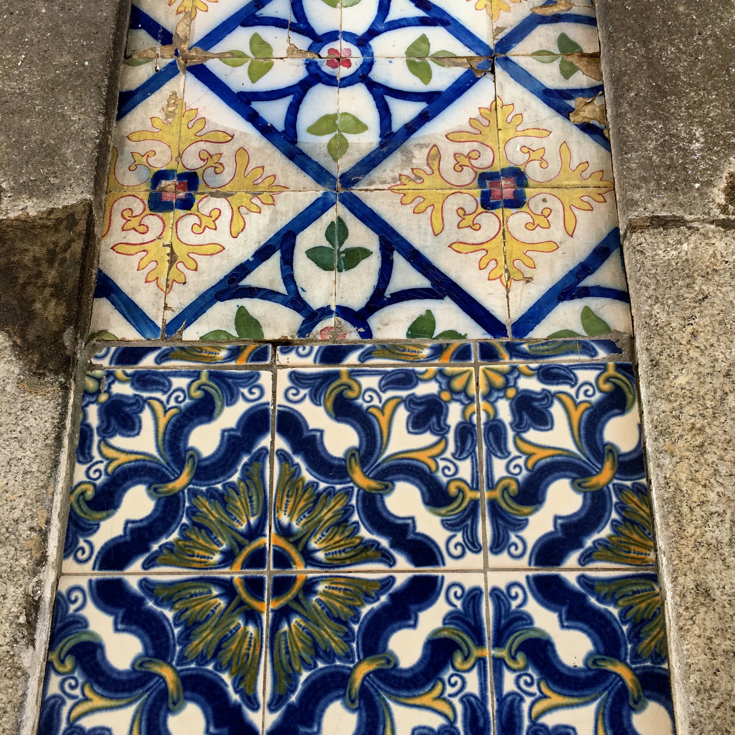
Blues featured too, and often mixed with yellows. The ones below have a touch of kaleidascope to them don't they?

And it looks as if many of them have been patched up and that just adds to the charm.
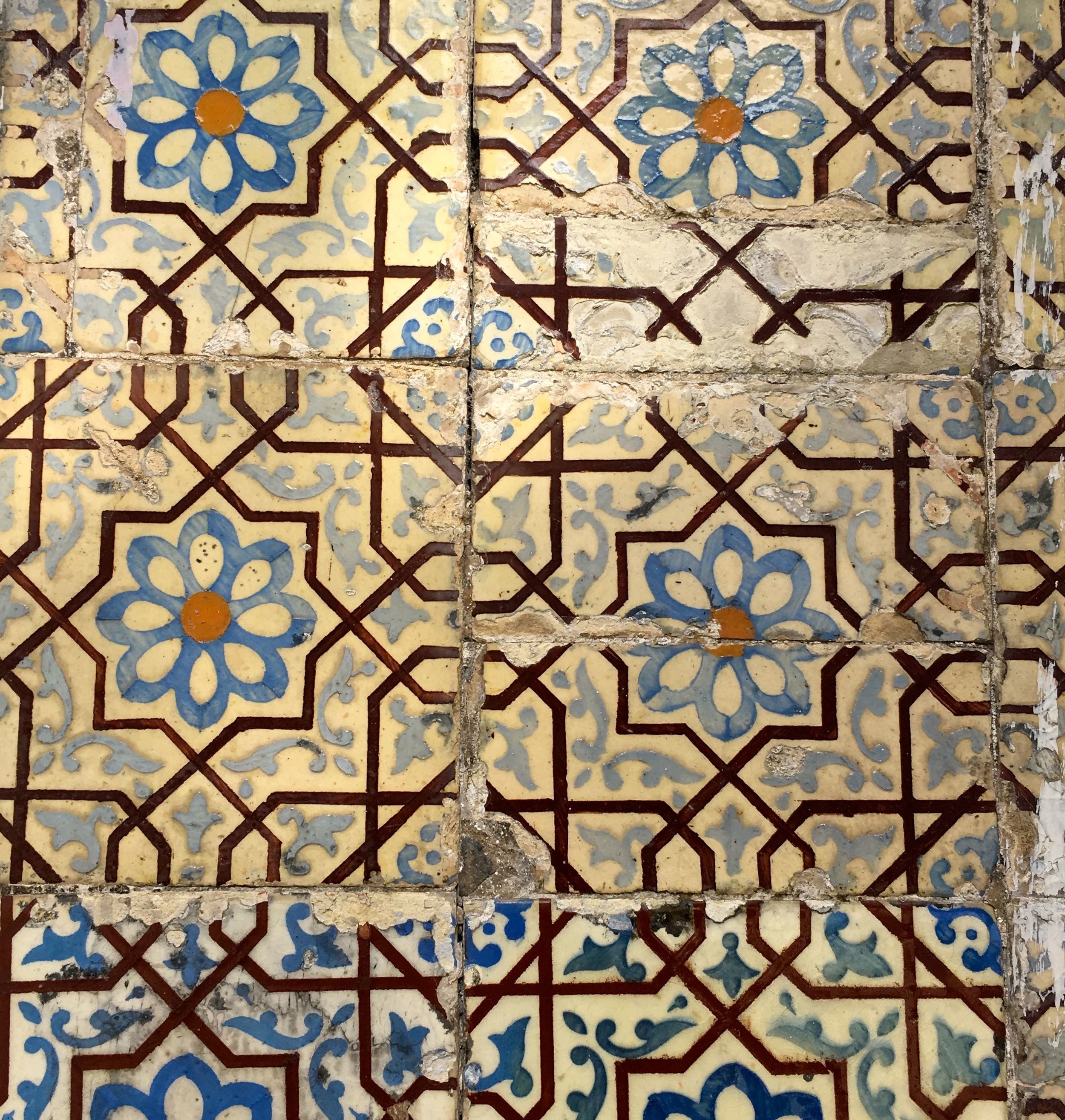
The patterns are mixed, the tiles are chipped and faded. But they are full of character and just work.

The colours are vibrant as often as they are faded, and I think there's almost more filler than tiles in the set below.
But some are in much better condition and this blue and white bold design in good condition almost looked out of place!

And every single one of these sets are on the outside of buildings, just for the record I haven't gone on my biggest snoop ever!
Aren't they great?