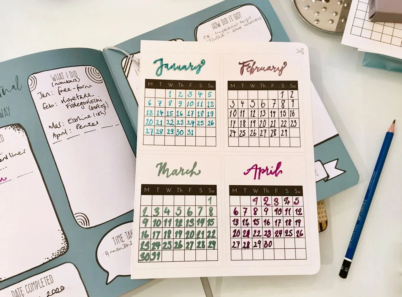
Towards the end of last year a lettering spark was reignited and I tried some brush lettering for the first time in a long while, and I mean decades. I quickly remembered how much I’d enjoyed it before, though the more modern craft is called lettering rather than calligraphy, which does sound a bit more fuddy-duddy, the difference though is more than an update.
Lettering is drawing the letters, so more of a faux calligraphy. Calligraphy uses a ‘dip pen’ and the pressure applied informs the strokes of the letters created. Either way, the results are fantastic looking words.
I’m no expert, but I know that like most things, practice makes perfect, and so I hoped for some brush pens and some guidance in the form of a couple of books this Christmas, and I wasn’t disappointed. The books both take different approaches too, one’s much more hands on and contains projects, templates and exercises - that’s Kirsten Burke’s A Year in Calligraphy from the Modern Calligraphy Co, the other, Brush Lettering by Rebecca Cahill Roots of Betty Etiquette, is devoted to Brush Lettering.
I do love a good book to browse after lunch on Christmas Day, and both of these met that brief.
I was keen to get started, and impatiently waiting until we’d returned home. And where else to start but the first project of the year in Kirsten’s book, which as you’ve probably already guessed is a calendar.
I’m a book traditionalist and it felt a bit weird pulling out the perforated pages, let alone actually writing in the work book sections. However I overcame my instincts, including the one to only use pencil in the book, and set about making my calendar.
What I quickly learnt was, it’s not as easy as it sounds.
While the month headings were pre-printed in a pale grey meaning they could be easily traced over, the numbers needed to be created from scratch. There’s lots of guidance, but you’re still on your own. My patient self would have practiced, but my patient self doesn’t really exist so in I dived.
January’s numbers were freeform, and not too bad, but I had to remind myself that the point of this wasn’t about freeform. And so for the subsequent months I aimed to copy examples from both of the books, and from a much older calligraphy book I pulled from my bookcase. I tried a variety of pens too from the thin end of a brush pen, a felt tip, a marker and a fine liner to see which worked best.
Unsurprisingly the metallic marker I used for March gave me the most problems for “fitting the numbers in the boxes” and despite what it may look like, we’re not having a 39th March this year.
I also learnt that swirls on numbers are hard to keep consistent - see April - and after writing lots of numbers, somewhere around the 19 April I lost count, and almost had two of those, which would have made for a really long month!
Recognising the limits of my concentration - I’d like to say it was four months, but really it was about 3 point something worth of months - I decided to stick with the first four months of the year for this project, for now. It’ll be interesting to return to this - hopefully sometime before May arrives - to see if there’s a noticeable difference or not.
I’m pleased with how these turned out, so expect to see these month cards in various Instagram posts, as now that I have them I’m definitely planning to make the most of them.
