A year in calligraphy: My 2020 calendar

Towards the end of last year a lettering spark was reignited and I tried some brush lettering for the first time in a long while, and I mean decades. I quickly remembered how much I’d enjoyed it before, though the more modern craft is called lettering rather than calligraphy, which does sound a bit more fuddy-duddy, the difference though is more than an update.

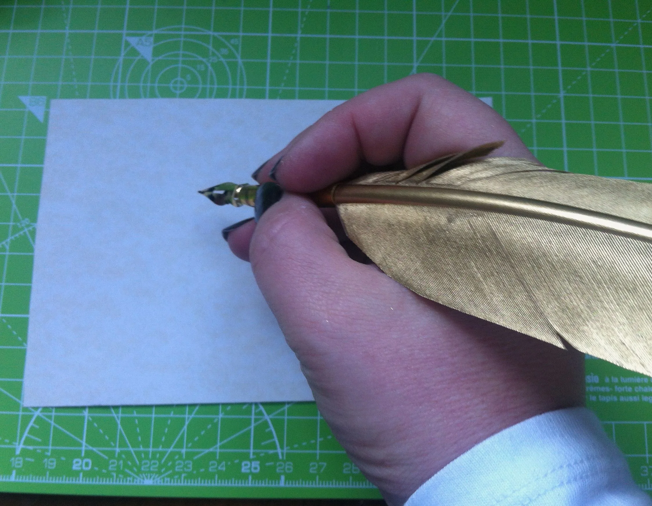
Lettering is drawing the letters, so more of a faux calligraphy. Calligraphy uses a ‘dip pen’ and the pressure applied informs the strokes of the letters created. Either way, the results are fantastic looking words.

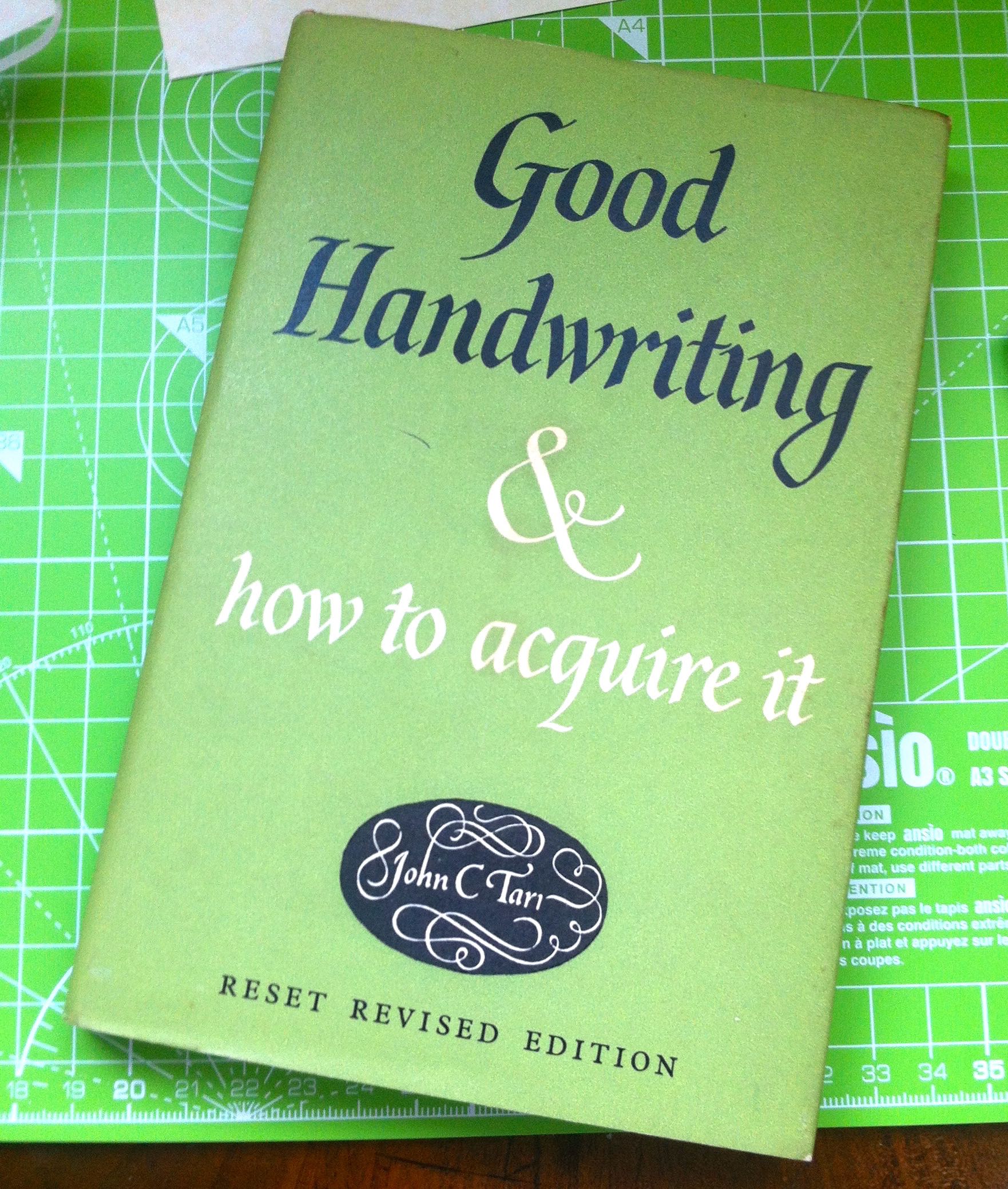
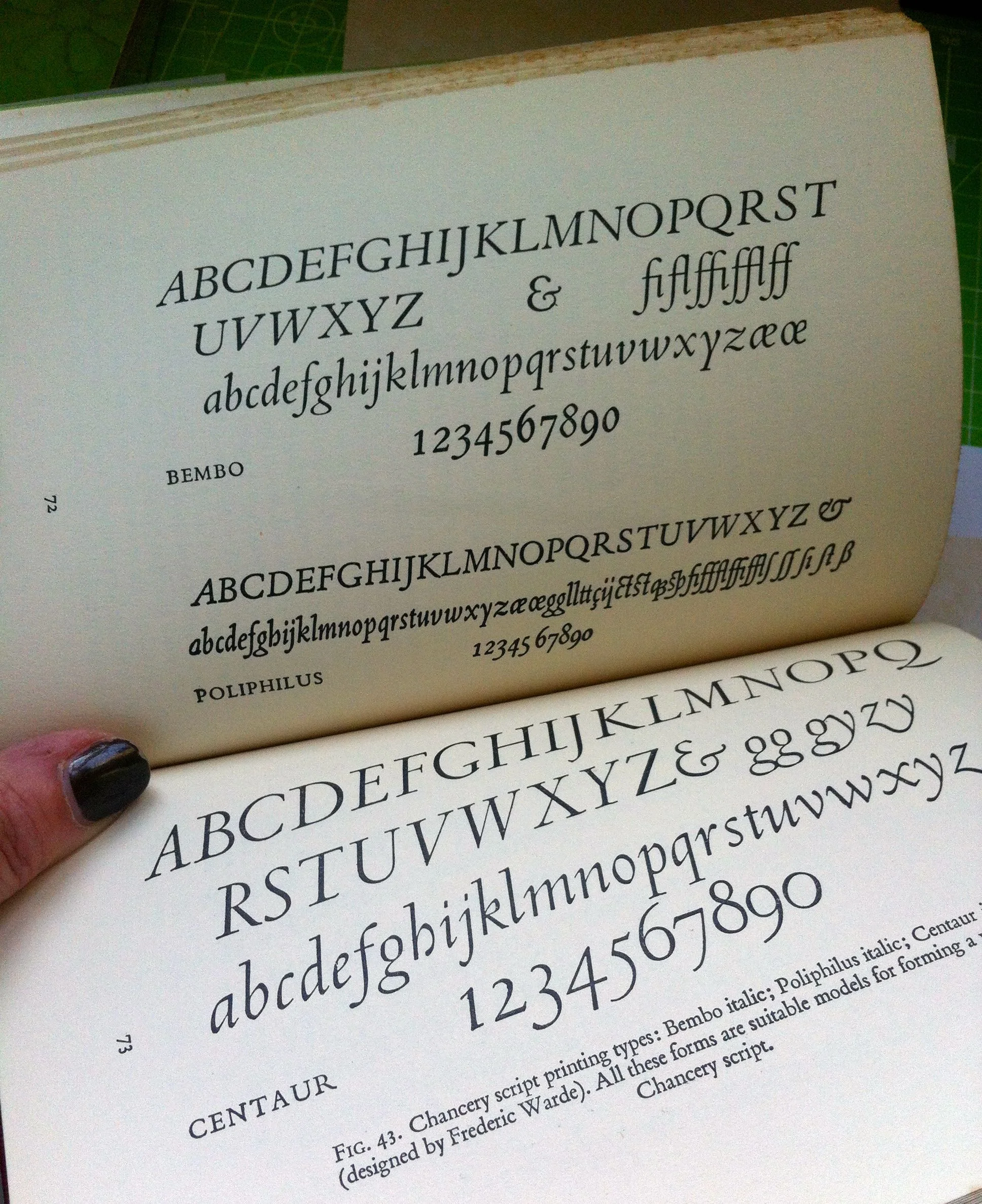
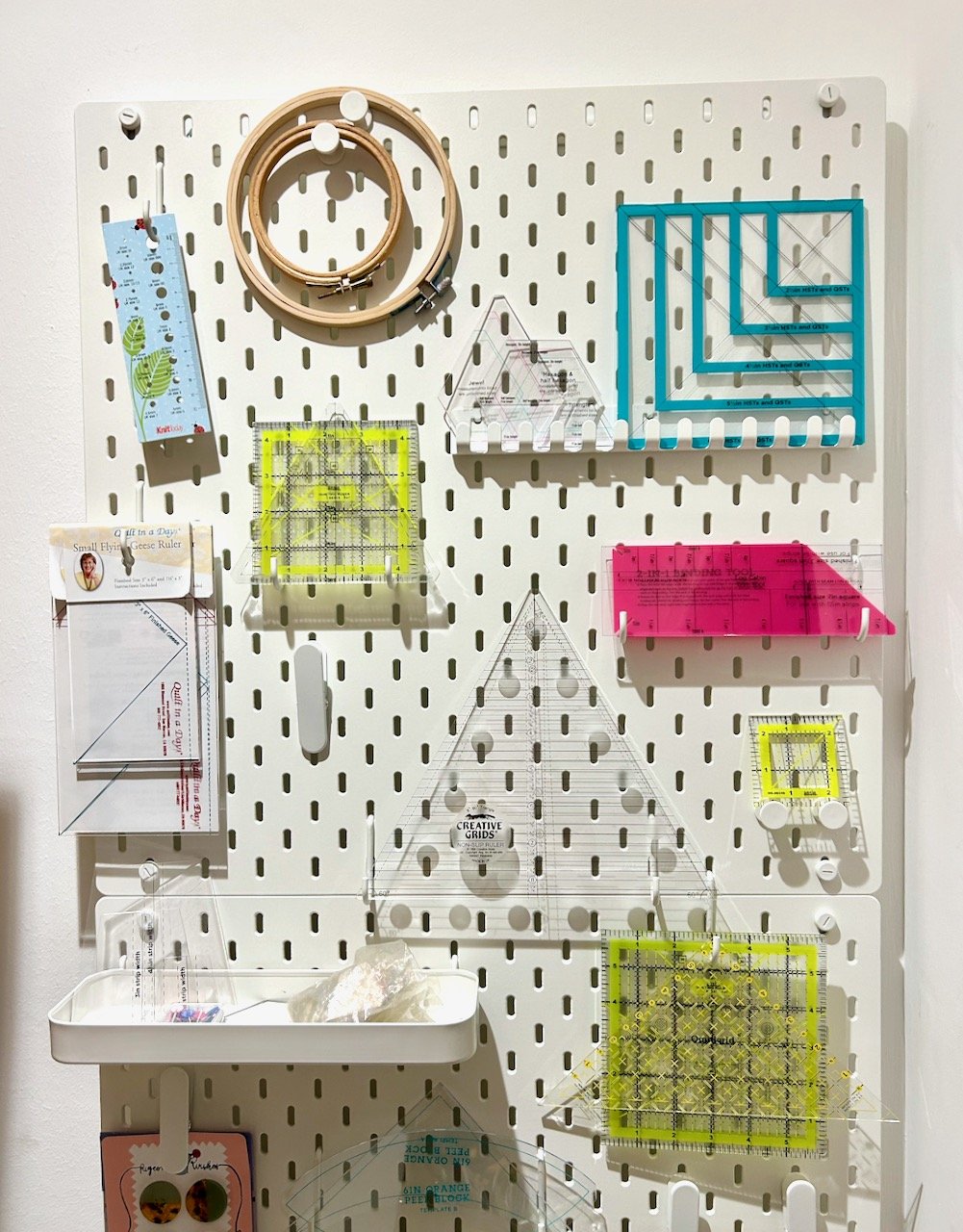
I’m no expert, but I know that like most things, practice makes perfect, and so I hoped for some brush pens and some guidance in the form of a couple of books this Christmas, and I wasn’t disappointed. The books both take different approaches too, one’s much more hands on and contains projects, templates and exercises - that’s Kirsten Burke’s A Year in Calligraphy from the Modern Calligraphy Co, the other, Brush Lettering by Rebecca Cahill Roots of Betty Etiquette, is devoted to Brush Lettering.

I do love a good book to browse after lunch on Christmas Day, and both of these met that brief.

I was keen to get started, and impatiently waiting until we’d returned home. And where else to start but the first project of the year in Kirsten’s book, which as you’ve probably already guessed is a calendar.

My calendar in progress

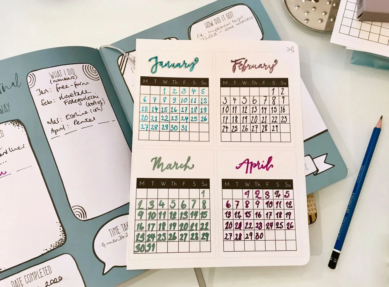
I’m a book traditionalist and it felt a bit weird pulling out the perforated pages, let alone actually writing in the work book sections. However I overcame my instincts, including the one to only use pencil in the book, and set about making my calendar.

What I quickly learnt was, it’s not as easy as it sounds.

While the month headings were pre-printed in a pale grey meaning they could be easily traced over, the numbers needed to be created from scratch. There’s lots of guidance, but you’re still on your own. My patient self would have practiced, but my patient self doesn’t really exist so in I dived.

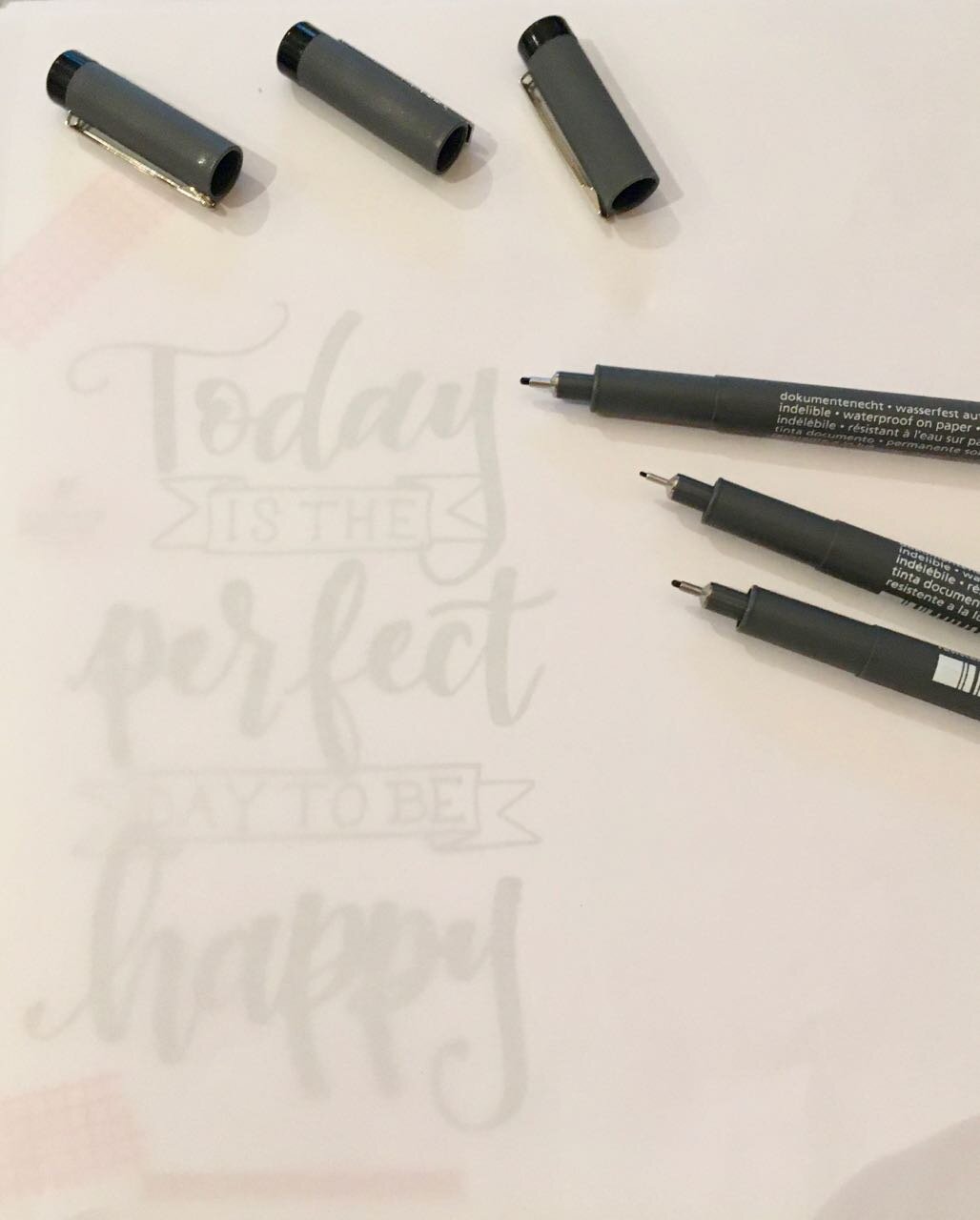
January’s numbers were freeform, and not too bad, but I had to remind myself that the point of this wasn’t about freeform. And so for the subsequent months I aimed to copy examples from both of the books, and from a much older calligraphy book I pulled from my bookcase. I tried a variety of pens too from the thin end of a brush pen, a felt tip, a marker and a fine liner to see which worked best.

Unsurprisingly the metallic marker I used for March gave me the most problems for “fitting the numbers in the boxes” and despite what it may look like, we’re not having a 39th March this year.

I also learnt that swirls on numbers are hard to keep consistent - see April - and after writing lots of numbers, somewhere around the 19 April I lost count, and almost had two of those, which would have made for a really long month!

4 months done in this first project

Recognising the limits of my concentration - I’d like to say it was four months, but really it was about 3 point something worth of months - I decided to stick with the first four months of the year for this project, for now. It’ll be interesting to return to this - hopefully sometime before May arrives - to see if there’s a noticeable difference or not.

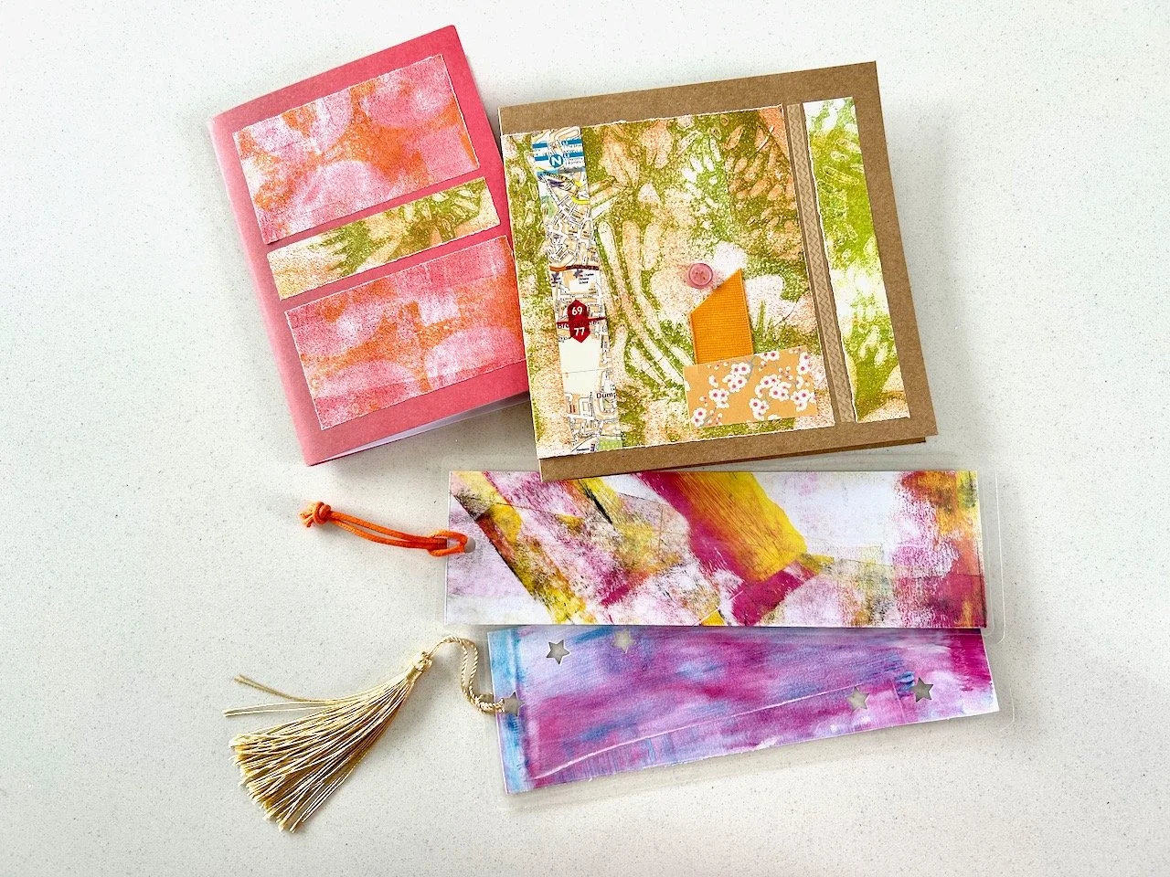
I’m pleased with how these turned out, so expect to see these month cards in various Instagram posts, as now that I have them I’m definitely planning to make the most of them.

Trying some brush lettering

* This post contains items that were gifted by the London Graphic Centre

It was good to take things a little slower this last weekend, and it gave me the perfect opportunity to test out those dual ended Brush pens and pigment liners which I received as part of the parcel from the London Graphic Centre, which they sent for the purposes of this review.

As I said in yesterday’s post, lettering - or calligraphy, as we called it then - has been a craft I’ve always been partial too, but along the way, a bit like actually writing it’s fallen by the wayside. There’s a new magazine out which I’ve been eyeing up, which has reignited my interest, so when the London Graphic Centre asked what crafts I liked, there was no hesitation.

I’m a bit rusty though. But that hasn’t stopped me, as they say, practice makes perfect. And if it doesn’t bring perfection, it definitely brings confidence and enjoyment and improvement. I’ve seen that even in a just short time. I started small, and then moved onto some practice sheets - the less said about the Fs the better.

As impatient as ever though, I wanted to try to create a quote and add some colour blending. It may sound like running before I could walk, but I was pleased with the results - friends and family can now expect ‘lettered’ cards. Just saying.

I decided that I could create beautiful results, and build my confidence, by tracing the quotes and the Marker Pad sent by the London Graphic Centre was just the thing as the outline of the quote was easily visible, and with it held in place by some pretty washi tape, I was off.

there is beauty in everything

There is beauty in everything.

it’s true, there is - and this was something I reminded myself as some of my lettering was wider than the quote I was copying from - but I’m human, not a machine, and even the neatest writer has variations in their lettering, I’m sure. As you can tell, I was keen to move onto the colour blending part.

colour blended brush lettering

For the quote above I went freehand adding the yellow and lilac pastel colours on top of the pastel pink with great results. If you know me, you’ll know pink and orange is one of my current favourite colour combinations, including my hair (only a section of it as all over might be a bit too much even for me). My hairdressers have a bowl of retro sweets on the reception desk, and I always fish out the Fruit Salads, giving the Black Jacks a wide berth. On my last visit my hairdresser made the connection between the sweets and my hair dye combo, which really is quite unintentional, but no bad thing!

Realising that I’d hit on this winning colour blending combination through pure chance and personal preference, i wondered which other colours would work. Not wanting to mess up any great (or even not too bad) artworks, a key was needed, and quickly created.

COLOUR BLENDING - MY PASTEL GUIDE

COLOUR BLENDING - MY PASTEL GUIDE

It’s already proven to be really useful. And I suspect as my brush pen collection grows, let’s face it - it’s going to, it will be added to.

I wanted to try more though, so found another quote - Today is the perfect day to be be happy - and off I set again. I thought I’d try this one using the pigment liners, but being such a colour fan, I couldn’t bring myself to do a plain black and white version.

trying a different approach
today is the perfect day to be happy
Colour blended - the blue version

Overall, I’ve had a productive weekend, and a great reintroduction to lettering. I’ve done more than these two, and am already seeing improvements and bravery with the colours, but more on that another day.

And look, I even attempted to conquer my fear of Fs. Perfect (well, good enough).

* With thanks to the London Graphic Centre for providing the materials used in this post, for the purposes of this review.

PoCoLo

Nothing will come of Nothing

So by now I expect you'll already know that this weekend we're celebrating the Shakespeare's 400th anniversary. That's quite a milestone isn't it? To celebrate Viking, the stationery suppliers asked if I'd create something with a favourite Shakespeare quote.

But where to start?

There are so many well known Shakespeare quotes - even Prince Charles was getting in on the act today - but which one would I choose. I decided to steer clear of the obvious ones and was surprised just how much influence Shakespeare has had on our language.

  • Knock, knock! Who's there?

  • Good riddance

  • Heart of gold

  • Baited breath

  • Dead as a doornail

  • The world is my oyster

  • Off with his head

  • What's done is done

  • Vanish into thin air

  • Too much of a good thing

Yes all of these are derived, and attributed to Shakespeare and these aren't all of them either. You'd be surprised, well I was anyway.

So which quote would I choose? Here's some of the letters...

die cutting letters

Did you guess?

I choose Nothing will come of nothing from King Lear.  

nothing

I cut the two nothing's using my die cutter and decided to try my hand at calligraphy for the rest of the quote.

Realising it's been a (long) while since I've done this - I hope to share more of one of my early attempts soon - I decided to dig out an old book titled "Good Handwriting & how to acquire it" which I picked up a few years ago for £4 in a charity shop.  I've no idea if it's worth anything - four pounds or anything more - but it's a beautiful book.

good handwriting book
calligraphy

And having swotted up on the Centaur font I was ready to go. With my quill - everyone has one right? - I set about adding some text to my parchment background. Well parchment just seemed the right way to go...

writing with a quill

And there you have it.

"Nothing will come of nothing."

nothing will come of nothing

And you know what? It's perfect for my once empty frame in the "spare" pigeon shelves which have found a home in my craft-room-cum-study!

In case you're wondering about my quote...

It means that you will gain nothing if you invest nothing. And that's something I totally believe in, (sadly) I'm not the type of person where everything comes easy. Where and when I have success there's hard work behind it, I truly believe that nothing worthwhile is ever handed to you on a plate, it's something you have to work for and on to make the best of.

In King Lear, he is telling his daughter Cordelia that she will gain no favors from him if she does not make elaborate speeches saying she loves him.  I'll admit I'm not familiar with the whole story, but this quote spoke to me.  I do remember though, studying Macbeth and Henry IV part 4 at senior school with a very enthusiastic English teacher.

Do you have a favourite Shakespeare quote? Let me know in the comments.


This is a collaborative post with Viking, the stationery suppliers to celebrate 400 years of Shakespeare but all opinions are my own