A tale of two desks

It’s only taken us about a year of working from home, but finally we’ve sorted ourselves out a desk each. Up until then each day we’d based ourselves at our kitchen table, and it worked well for us and our circumstances then. With MOH starting a new job we knew that having us both on the phone, or on Teams calls at the same time wouldn’t work so well, so we needed a new plan. But it needed to be flexible. We are fortunate to have the space to set up work areas outside of our bedroom and living space. I knew that I needed to avoid working in the craft room/study as there would be far too many distractions, and it’s the room where our wifi has the worst reception.

MOH opted for our spare room, we have futon in there and he has a dartboard and records there - he has much less of an issue with distractions than me, clearly - which left me the top bedroom, which was more than ok with me, as it’s a light and bright room and somewhere we spend very little time. We don’t have the space for two desks to remain in place all of the time, alongside our other furniture and so one of the desks needed to be foldable. I was keen that they were both something we liked, would use again and could be repurposed - and not look out of place - in other parts of our home.

Not quite the mission impossible you might be thinking. The folding desk was the easiest to source, and by looking at many desks I learnt a lot. The desks were mainly a metre wide, the depth more variable. Compared to our kitchen table most of the desks were about 10cm wider, depth at the kitchen table wasn’t an issue. In our spare room the alcove is 110cm and could take a deeper desk, so our plans were on track.

Then I saw, and fell in love with, the desks on the Hairpin Leg Co. Smitten. The sizes didn’t quite work though, so I researched custom made options. I knew I could buy the legs on the hairpin’s website, so I looked for laminate tops, and I found many which involved varying degrees of assembly and drilling. Then I struck gold on Etsy, finding The Laminate Top Company - given the company name where I started, the irony on where I ended up isn’t lost on me.

MOHs new desk.jpeg

I ordered my desk and it was delivered within a couple of days from one of the larger delivery companies that sells just about everything. I ‘sold’ the ply and orange legged desk to MOH, who didn’t take much persuasion - as “a desk’s a desk” - and I impatiently waited. It arrived on schedule, though given our current troubles with deliveries I was keeping an even closer eye on this one, and at one point one of the parcels (it came in two consignments), according to the online tracking had had a failed delivery. Thankfully in the end it was pain free, and I couldn’t wait to check it over.

The ply top. The chamfered edge - oh, just look at that edge. The legs. Perfection.

The ply top with headphones and notebook.jpeg

MOH was impressed too, even more so when he put it together. And so his desk is in place - and in use - too. The original plan was to put it in the alcove by the window, however with the change in weather - and the WFH coldness setting in - sitting next to the window isn’t the most sensible thing. When we make use of the futon it will move into the alcove, and in the warmer weather being closer to the window and overlooking the garden will work too. I bought a throw for the spare room, and put it handy so MOH could make use of it. I never thought he would, but today he let on it had come in useful - but only after he laughed at me for having a blanket over my lap…

spotlight on the ply top.jpeg

It suits him, he’s minimalist. And as he says, a desk is a desk.

ply top hairpin legs and a pile of paperwork.jpeg

It may just be a desk, but it’s gorgeous - and longer term I’ve got my eye on it for my craft room. But sssshh, don’t tell him.

My desk isn’t as gorgeous and stylish as his, but it’s just as useful and has the potential for future use too.

My desk with headphones laptop ipad and stationery.jpeg

You can tell our different approaches just by looking at our layout can’t you? I have headphones, a notebook and plenty of pretty stationery, and a lamp from the bedside table which has temporarily been displaced. I left it there to save unplugging it, as the plug is behind the bed, but actually it’s great to have a table lamp for those duller times of day.

stepping back from my desk to view the stool.jpeg

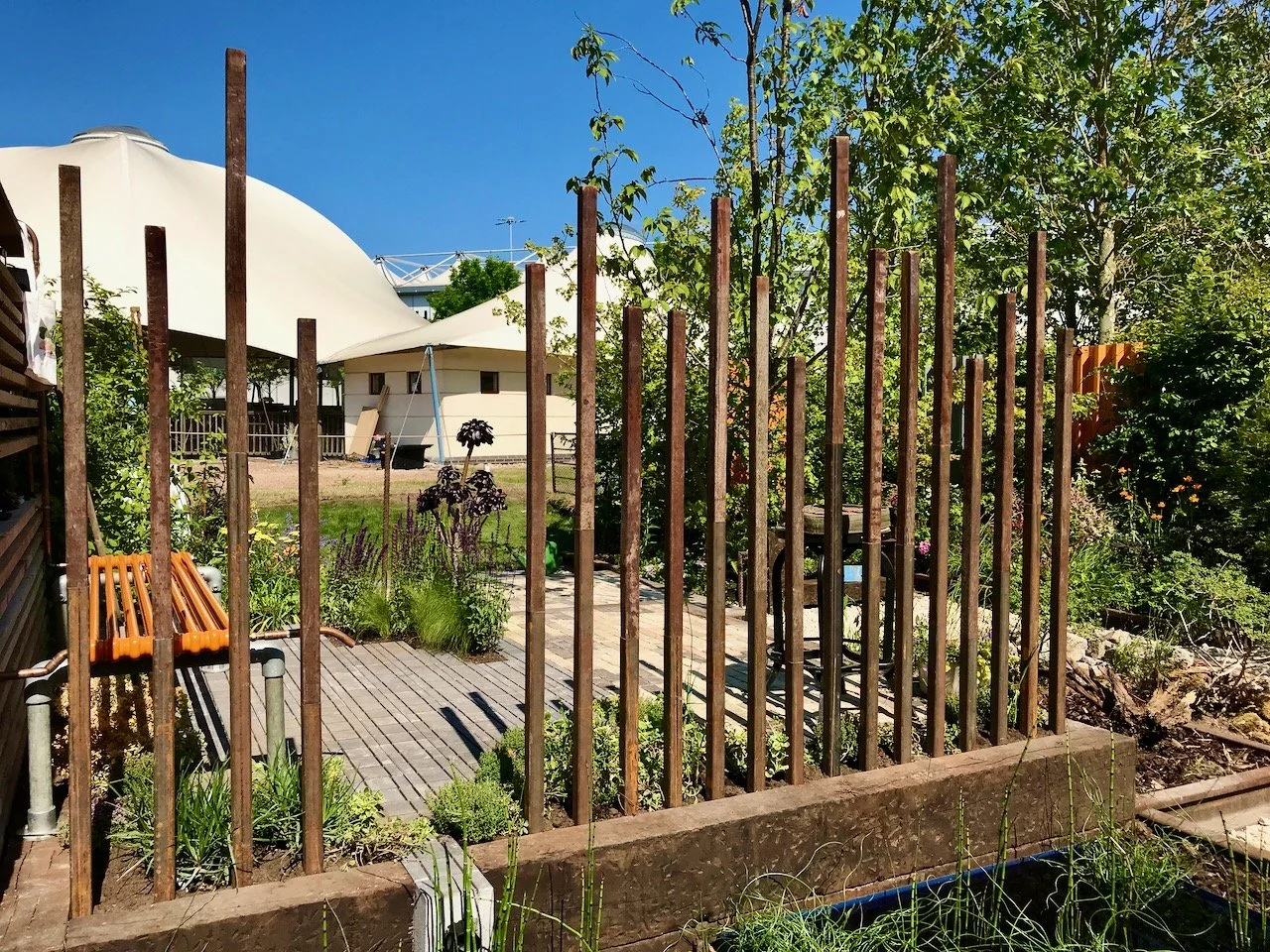
I read recently that the view from your desk should be inspiring, in both our cases neither could be called that. In my case the wall slopes and if I’m honest it’s not a view I spend much time looking at. With the amount of time I spend on Teams calls and in meetings, the view behind me is one I see much more often - and that one’s pretty stunning. A few weeks on, it’s still receiving comments from the people I meet.

the view behind me

So a year on, two desks later and we may just have cracked this working at home malarkey. Some things still don’t change, and MOH is still the chief tea maker in our relationship, now he has an extra flight of stairs to deliver it - or occasionally I get a call to collect it, either works for me. The only challenge? When the door bell goes, the front door is much further away, but I’ll cope…

PoCoLo

Finally, we have a picture in our living room

It's been quite a while now since we finished the decorating in our living room. We knew the wall above the sofa needed some artwork but I was struggling to find something that i) matched the new decor and colours, ii) didn't offend either of us and iii) was in our price range. It's quite a big space too, and I wanted a single picture there as having a series of pictures that we'd struggle not quite manage to hang level would have done my head in. I'm a detail person remember.  

Finding something that we both liked, or rather that neither of us found that offensive and something that wasn't totally detached from us was hard though. I've looked at numerous art sites and in many picture galleries and shops, never finding The One.  

In the end I didn't find it at all. MOH did. I think in desperation to get something on the plain wall he'd also started to do research. And what d'you know, John Lewis came up trumps. 

So after thinking about it for a while we ordered it. It arrived and I unpacked it:

unwrapped_picture.jpg

The next job was to hang it. And that was more complicated than it should have been. I was surprised that the picture didn't come with wire or a cord to hang it from, but no matter we had some wire somewhere...

The wire was found, but it wasn't sturdy enough for the picture - who knew they came with weight limits? Heavier duty wire was sourced and bought, and a video on how to secure the wire was watched and followed. Holes were drilled and screws screwed in. It was time to hang the picture...

What? What just snapped? Oh that'll be the heavy duty wire... Thankfully it snapped while we were wrestling it onto the screws, and while we still had hold of the picture. Phew. It seems the heavy duty wire wasn't up for the job.  

A week later and I've now bought some cord instead of the wire. It's attached and looks a lot more solid and reliable. So we tried again. And this time we had success. The picture is on the wall, and it's stayed there. Phew.  

picturehung.jpg

The verdict

  • I think it looks OK, I don't find it offensive but nor do I think it's overly personal for a living room and I'll quite happily look at this everyday. 

  • It reminds me of a trip to York we took a few years back; of the lanes with The Minster in the distance  

  • It reminds MOH of somewhere but he's not sure where. Which is better than I expected, I thought he'd say it's just splodgy lines... Although personally I just think he's glad to have got a picture on the wall!

Updated: June 2015

We've had the picture on the wall for about two months now and I'm really happy with it - it looks as if it's always been there.  The added bonus is when I'm in the open-plan kitchen it acts like a mirror and I can get a glimpse of what's going on outside, which is no bad thing!

Home Etc

Room Sets at the Ideal Home Show

I loved the idea of these Room Sets put together by Ideal Home Magazine to show off this season's design and style trends and the best of Britain's creativity. And while I was happy to wait for MOH to arrive before wandering around the Show Homes, I decided to head over and take a peek at these before that. They're all laid out on a single level too which made it easy to wander between the rooms, I'd loved to have been able to take a closer look but looking in was almost as good. And for each room there was an A4 sheet giving all the details of wall colours through to the accessories used, which now looking back after everything's settled is very useful, and a poster alongside each room giving tips on how to get the look.

There were five room sets with each covering the main rooms we all have, or have elements of. So let's get started.

1. Indigo & Earth Living Room

To get this look:

  • Paint walls in a deep blue or earthy brown
  • Include timber to warm up the dark wall colour and add a natural touch
  • Choose muted shades for furniture
  • Add polished metal accessories to add interest and avoid the room looking overly dark.

My view:

I liked the overall look of this room with its cosy, snug feel. It's definitely one you'd want to snuggle up in on a cold day.  The highlights for me were:

  • This gorgeous side table by Multiyork
  • The starburst mirror (shown above), also by Multiyork

But I was less keen on the molecular looking ceiling light and the textured table lamp in the foreground of the top shot - I'm not sure why, but I can imagine it would be a nightmare to dust!

2. Copper & Clay Bedroom

How to get this look:

  • Choose a warming clay pink colour for a feature wall and the lower wall sections, using a powdery pink colour for the upper sections.
  • Add a neutral toned floor covering
  • Add warmth with copper accessories and zig-zag patterns for interest and fun.

My view:

I was less keen on this room as I'm not a huge fan of copper. I think would be good for a teenage girl wanting a more grown-up bedroom.  My highlights were

  • the yellow and white zig-zag chair from Flock.
  • the shelves for pictures.

I can't see this ever being a look I'd go for but I think that's partly because of the colour and the furniture - I like Danish furniture but not the Ercol styles, I think they're just a bit too 1970s for me. And I know some of you will be thinking they're a design classic, but not me.

3. Sand & Stone Bathroom

How to get this look:

  • Choose a simple white bathroom suite 
  • Paint the walls in beach-coloured neutrals, the idea of these colours are sea-foam white, sandy beige and pebble grey
  • Add pale timber effect floor coverings for a driftwood feel
  • Add some luxury with marble accessories and beach-style accessories.

My view:

I wasn't keen on this room either and I didn't get that the colours were beach-y until I read the poster - I can see it more now, but to me the walls look more like mountains than a beach.

I think a white bathroom suite is always a wise choice - although I seem to be on a bit of a personal mission to rid the world of avocado (and other coloured) suites as almost every house I've moved into has had one! Note the past tense there.  Although I didn't like the overall look of the room, there were a couple of things I did like:

  • the inset shelves around the bath - great if you can build these into your room
  • the shelf by the sink, not only great for ornaments but also for toiletries too.

4. Slate & Leaf Dining Room

How to get this look:

  • Use a dramatic charcoal colour on the walls
  • Paint the door in a vivid green so it stands out
  • Add a dark wood flooring to give an almost tropical feel
  • Include some rich wooden furniture
  • Add green throughout the room in prints and accessories and of course greenery,

My view:

This was very much my favourite room set; I loved how dramatic it was, and how vibrant too. It may be that I'm tuned into Dining Room's at the moment (remember how I fell in love with that Danish table and chairs?) but I was a big fan of this room.

Of course it won't go in my house - we have an open plan kitchen/diner and lounge, but that doesn't stop me loving it! My highlights were:

  • The mix and match chairs - that's definitely something I want to replicate alongside a wooden table
  • The boldness of the black and green
  • The group of terrariums set in one corner on the floor.

5. Basalt & Rose Quartz Kitchen

How to get this look:

  • Start with a high-gloss kitchen in a pale colour
  • Add darker wood effect flooring
  • Paint walls and woodwork in a gentle rose quartz and soft greys
  • Keep appliances chrome or steel and add a striking splashback
  • Add black wood and clay accessories for natural texture.

My view:

I'm a fan of high-gloss kitchens, and the advice we had was always look at them close up - if you can see an orange peel texture (or similar to cellulite) then it's not as good a quality as the salesperson is telling you, and ask for a price reduction!

We weren't convinced and spent a fair bit of time staring close-up at many kitchen units before we bought ours, and once you start to look you can see a difference. Trust me. Ours is champagne, which is really a fancy name for a kind of grey with sparkly bits in.

I also liked:

  • the wall of high gloss cupboards, but I'm not sure I'd put a TV in the middle of them - an inbuilt coffee machine would be much more useful!
  • the pendant lights over the island, but I think that's my Dining Room bent coming out again as I'm looking at those for above our replacement table too!

So five room sets, each bringing its own inspiration - whether it's all or part of the room, what's your favourite?