Adding the finishing touches to our porch

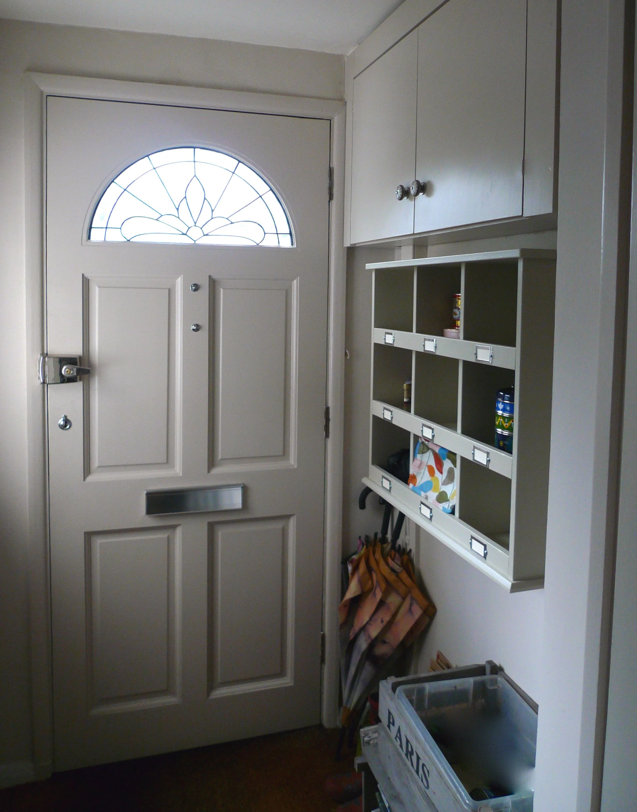
Usually when people talk about decorating their smallest room, we all know which room they have in mind. But for us our smallest room isn't that room at all, but our porch. It's so small that I doubt many people take more than two steps in it at a time, you can reach both the walls without having to stretch your arms hardly at all, but it does provide a bit of a buffer between our main living room and the busy road outside. 

It's also a functional space holding our fuse board and electricity meter along with our recycling, a few pairs of shoes, my wellies for the allotment and an umbrella or two. What it hasn't been for quite a while is pretty. But on Sunday afternoon that all changed. 

FinishedPorch.jpg

Hanging the pigeon shelves

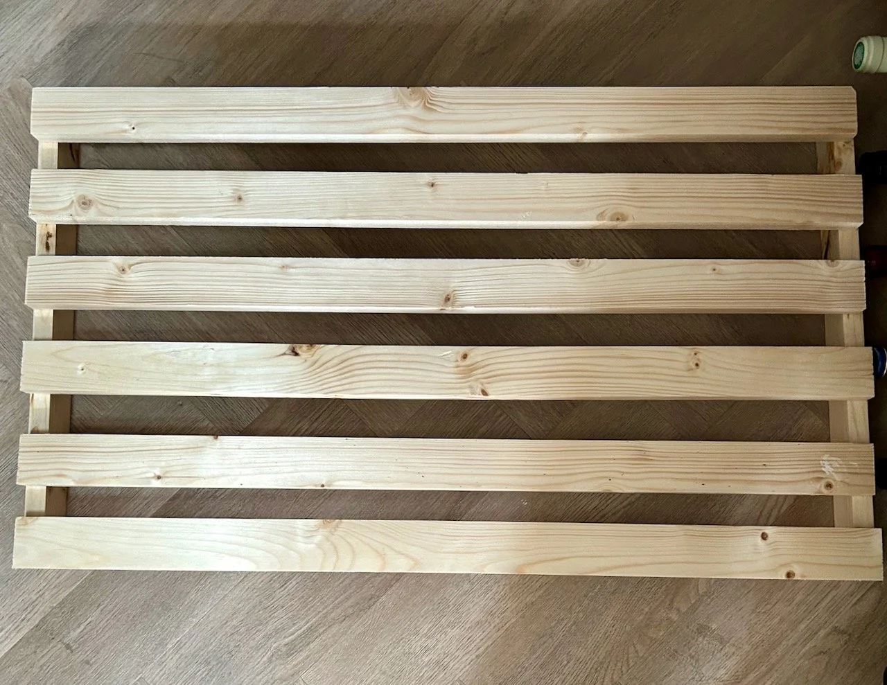
In an unexpected spate of activity we hung the pigeon shelves which we'd bought a while back from Dormy House. We'd bought them unfinished in the sale, unfinished because we weren't certain what colour to choose and because they were significantly cheaper that way. My reasoning was if we bought them painted and then changed our minds it wouldn't be so cost effective, and as there was a strong likelihood that we would change our minds we (the Royal we, that is) might as well paint them to start with. Completely sensical, yes?

Well MOH needed some convincing, but he dutifully set about painting the units - we bought two sets, and my original plan was to hang them both in this small space. That's the bit that changed in the end, but more on that later. With one set of shelves painted MOH was keen to get it hung on the wall and out of the way in the Conservatory, which had turned into his painting studio for the duration.

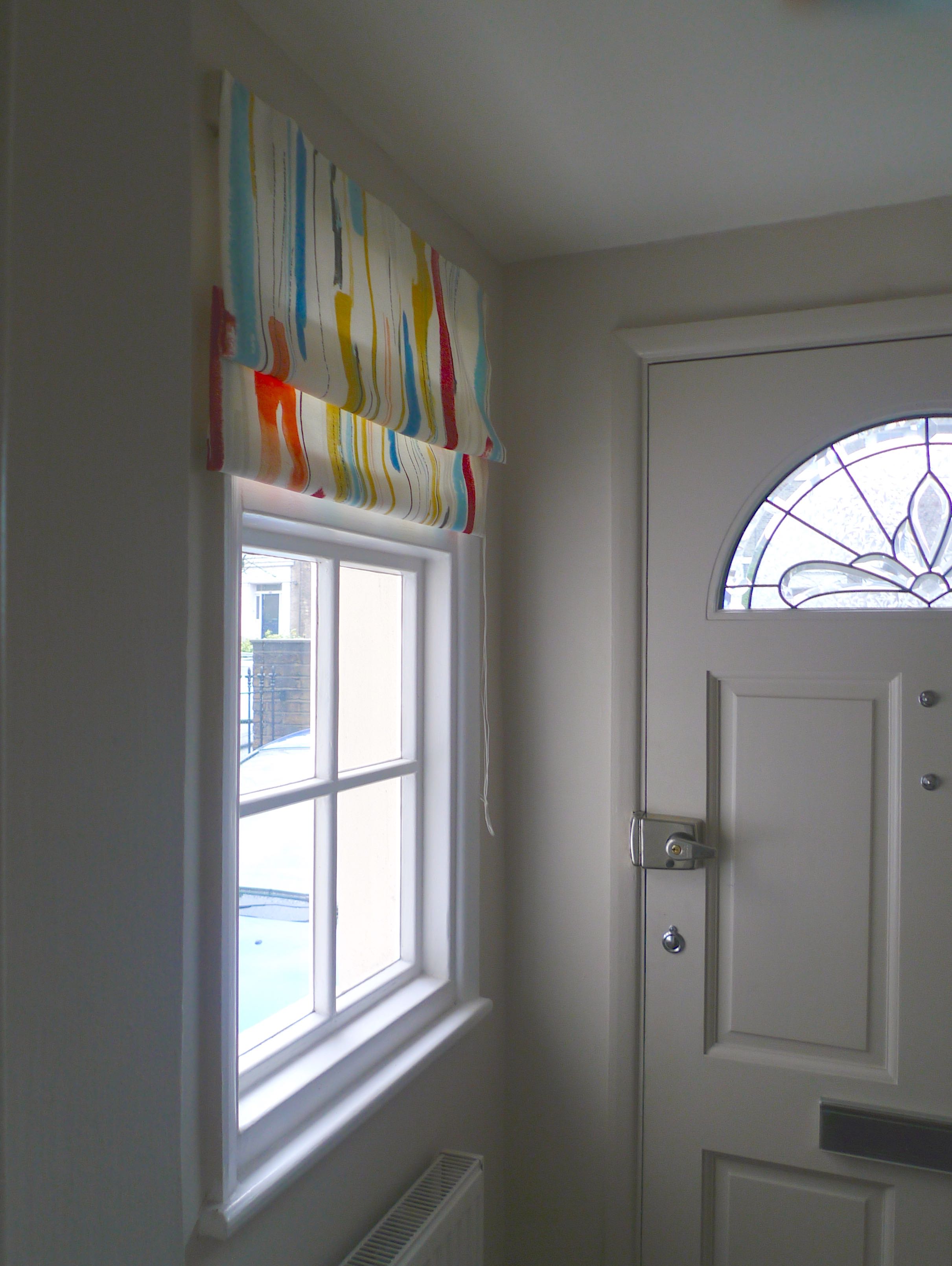
In the end we chose Farrow & Ball Old White for the shelves, which is the same colour (and paint type - so not another tin of paint to store) we'd used on the bookcase and radiator cover in our main living area.  The walls are Farrow & Ball Skimming Stone, so all very neutral and purposefully so.  The only problem was that it was, well a bit beige. Or grey, depending on your viewpoint.

I didn't mind that so much as it's not a room we spend much time in, and having these neutral colours means it's relatively easy to keep clean. And with it being so small, let's face it it doesn't take long to give it a coat of paint. It is probably the most painted room in our house!

Adding some colour

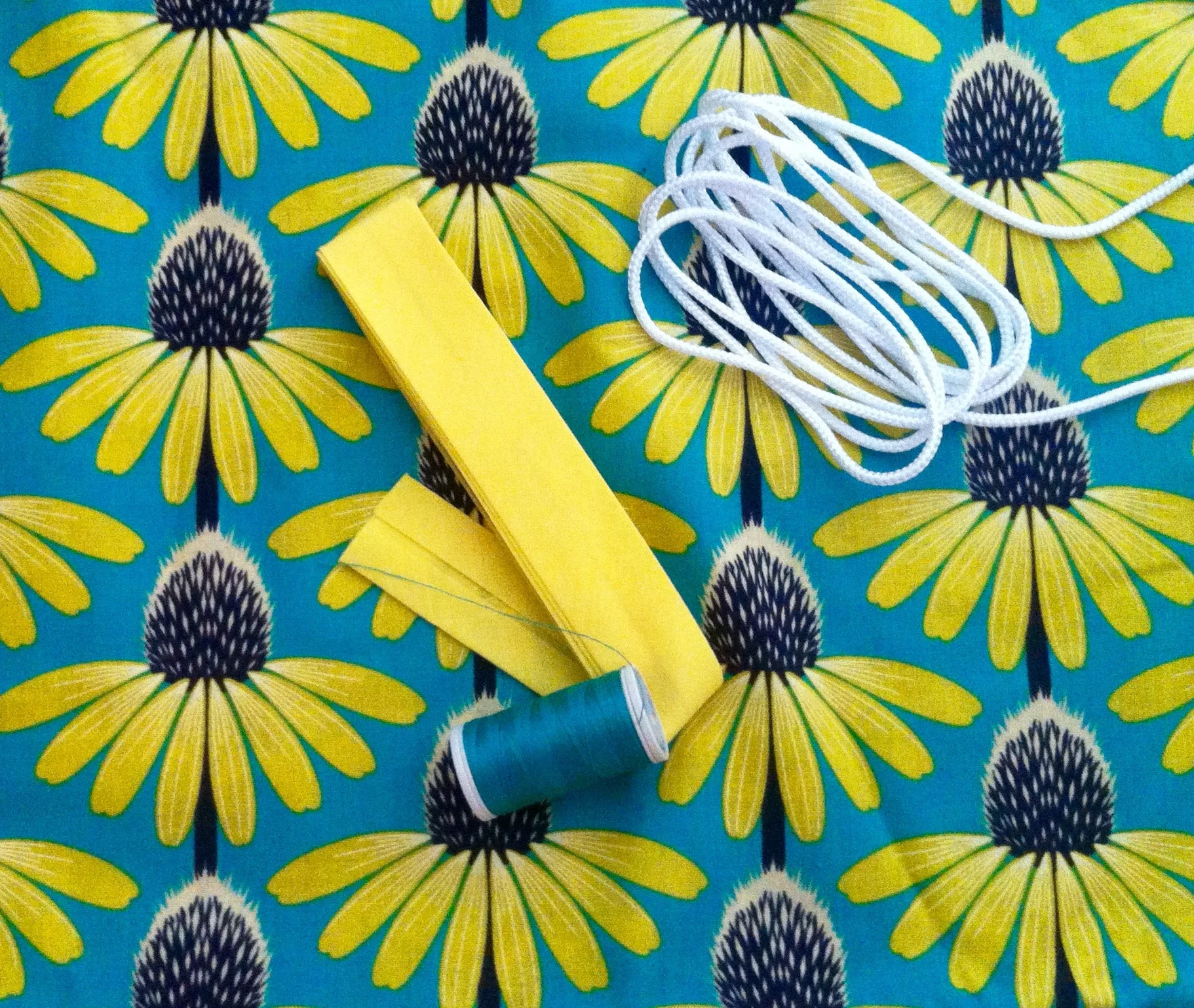
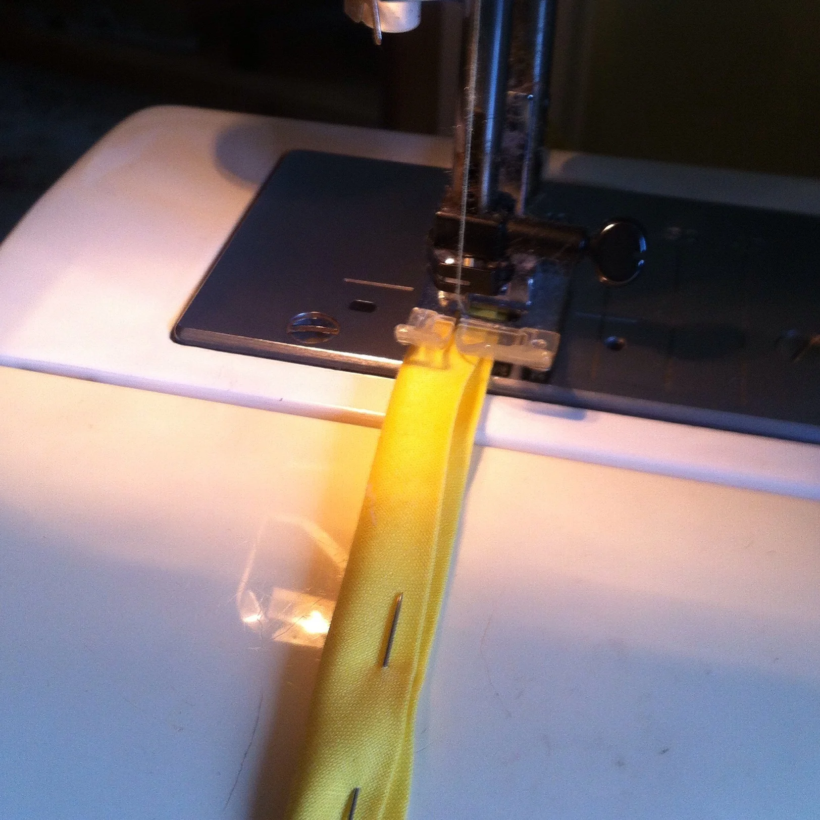
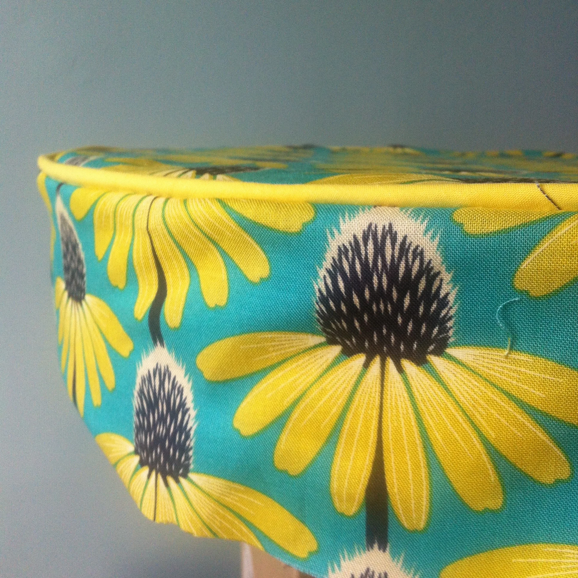
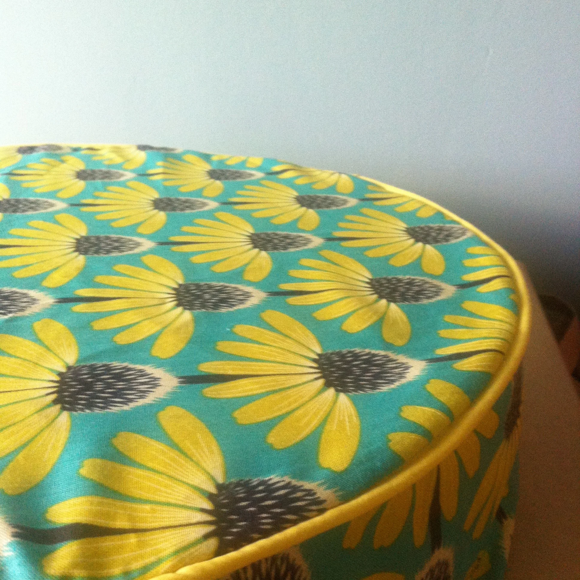
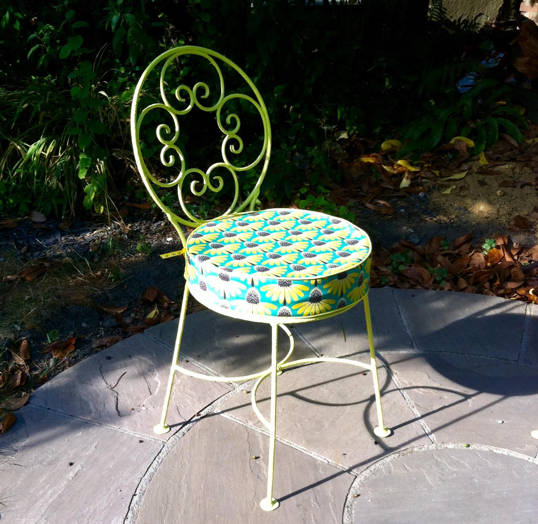
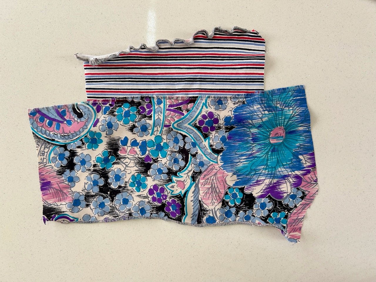
A while back I'd been gifted a selection of Prestigious Textiles' new Java range, well looking at it again I realised that it matched quite nicely with our updated colour scheme now we planned to add Ocean (blue) and Mustard (yellow) chairs to our downstairs space. So I set about making a faux Roman blind with one of the fabrics.

I've mentioned it before but the sewing in this blind was minimal. Instead of being challenged by the sewing, as expected it was two of my other loves that came into play - ironing and maths!  And if you're wondering why it's a faux Roman blind, we never pull the blind here so it didn't need to cover the window, it just needed to be deep enough to dress the window.

It looks quite good, I think. And does inject some much needed colour into the space. I still need to get a cleat and find something suitable to act as a toggle for the blind cord, but all in good time...

PorchRomanBlind.jpg

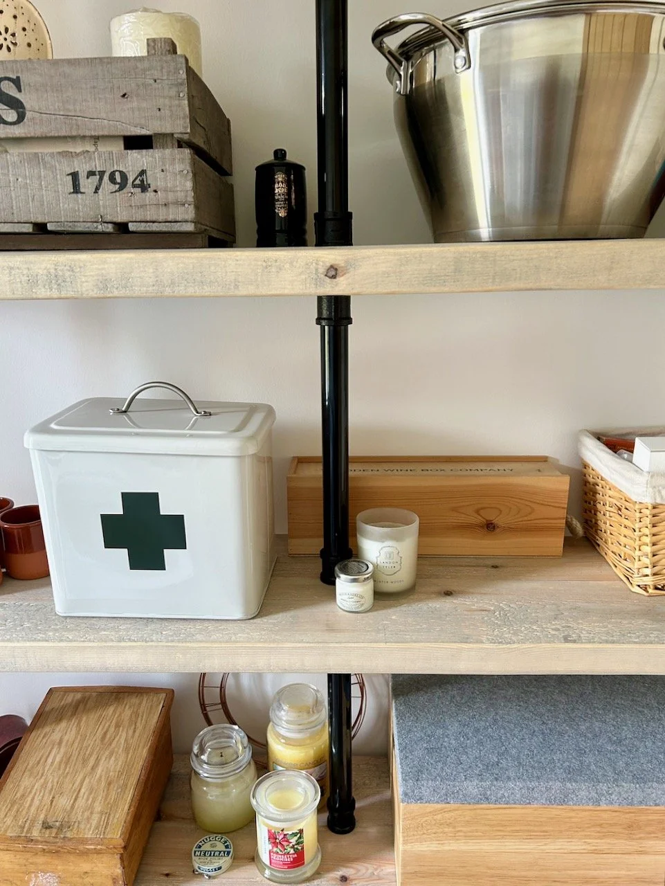
So with my Roman blind hung and my pigeon shelves on the wall, it was time to collect some of the items I've been saving to store in them.  My aim is to add colour to the porch with the items we store here, but to keep it functional and as cohesive as I can too.  The black treacle tin has used stamps, while the golden syrup tin is holding the batteries we need to recycle. I love these classic tins and giving them a new use, but I think I'll have to keep my eye on them in case they just happen to fall into the recycling basket below with help from MOH when I'm not looking!

pigeon shelves

The Indian Tiffin set was a birthday present and I knew it'd look good here. I haven't worked out if I'll use it to store anything yet, but it does make me smile each time I walk past.  

Saddlebag & pump

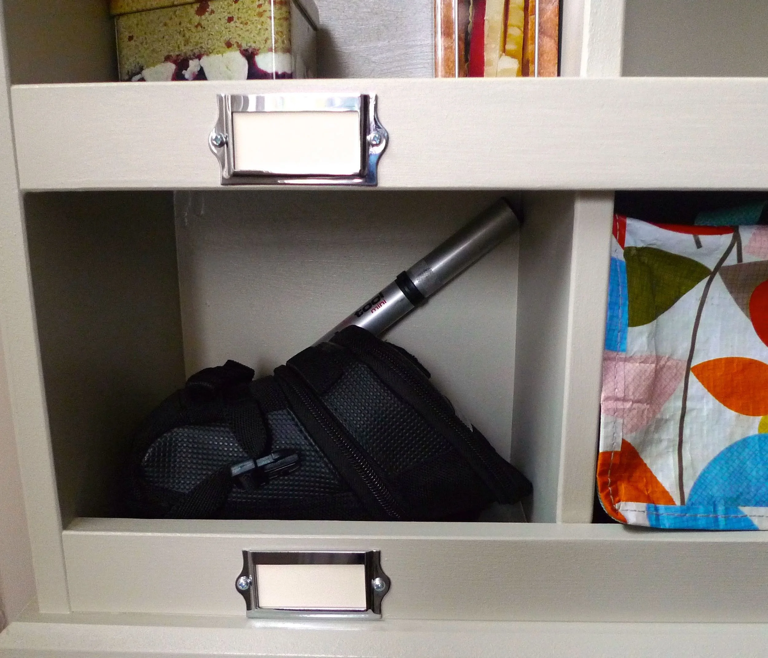
The other purpose for the pigeon shelves was to store some of our cycling gear - we knew they wouldn't be large enough for helmets, but I've an idea for those (not yet implemented, of course).  

I've added the mini cool bag I use when we take lunch out cycling, and inside there's a flask with the same pattern. Some pretty tins, and some notebooks, you know the sort of stuff.

MOH has added a saddle bag and a pump - can you tell which of us is the less frou-frou?  

Ah well, they're supposed to be functional too - but perhaps I could make a little curtain for the less pretty sections...

So it's been quite a while coming together, but finally I think we're there. Our porch - our smallest room - is starting to add prettiness to its purpose.

And that second set of pigeon shelves? 

Well they'd be perfect in what I call my craft room and what MOH still calls the study. There's only one wall they can go on in there, so I need to work out how to make it work - and choose a colour, because I'm not sure this colour would work so much, and I might need to repaint some of the walls too, to get it just right.

But I'm starting to plan, and starting to be quite excited about filling it with craft supplies. MOH will no doubt roll his eyes and not understand why I need all that stuff, but I'll remind him he can call the spare room with his records and dart board his own, I think...

A coat of paint and some new cushions

A while back I bought some wrought iron garden chairs on eBay and knew they needed a bit of TLC. I also knew that I didn't want to repaint them white either, but I wasn't sure which colour to choose.  We already had an old iron table in Antibes Green - another eBay purchase which needs some work - and I was keen to keep the table the same colour, but was struggling to find the colour I needed and I absolutely refused to go the Hammerite route. I mean there's nothing wrong with Hammerite but i) they didn't have the colour I wanted and ii) I still wanted the table to retain its character, and some of its rust much to MOH's dismay.  

Anyway I've discovered that Annie Sloan's chalk paint comes in exactly the colour I want and although I haven't bought it yet, or started to tackle the table I knew that whatever I did with the chairs, they had to match the table I was planning.  When I saw that Farrow & Ball had a new yellow colour in their range I went to investigate. It is a bright yellow and has the fab name: Yellowcake - so with a name that includes two of my favourite things I was sold!

THE EBAY PICTURE

THE EBAY PICTURE

GETTING READY TO PAINT

GETTING READY TO PAINT

STIRRING THE PAINT: YELLOWCAKE 

STIRRING THE PAINT: YELLOWCAKE 

YELLOW!

YELLOW!

Before any painting could start the chairs needed to be rubbed down and a rust treatment applied and MOH set about this with gusto. I think he'd rather I'd bought new chairs as there was "years and years of paint on these" but I was less keen. So painting them became my job, so paint them I did.

Bright yellow. Yellowcake yellow.

In fact they're not as yellow as I'd hoped!  But I am pleased with them. I like that they're bright and cheery and I don't mind that the paint finish isn't smooth as a new chair would be. And most of all I like them because they're yellow and quite unexpected!

They're the sort of garden chairs that need a cushion and when I saw this material I knew it was perfect for my pre-loved chairs. So I bought some quizzing the lady in John Lewis about how much I'd need and checking my instinct on how to make the cushions I had in my mind - you know the sort, the sort with neat piped edges.  I had it in my mind that I'd make these cushions and overlooked the fact that I'd never done anything quite like this...

CUSHIONMATERIALS.JPG

So with foam inners that were cut to fit the seat of the chair I was running out of excuses so I set about finding a tutorial on how to sew the piping and get sewing.

FOAMCUSHIONINNERS.JPG
SEWINGPIPING.JPG

It turned out the lady in John Lewis was right when she said she wasn't much of a sewer as I've more material than I needed - which I don't mind as it's lovely - but quickly ran out of bias binding so came to a halt until more supplies arrived. It was quite a timely pause as it gave me time to work out how to do the next bit and to get some tips from my dressmaker mum.

CUSHIONSUNDERWAY.JPG
CUSHIONWITHPIPING.JPG

When the additional bias binding arrived I was flying and both cushions are now complete:

FINISHEDCUSHIONS.JPG

I added ribbon ties to the back of the cushions. I considered making ties from the bias binding but then remembered I had this grosgrain ribbon with the same yellow and liked the contrast it gives.

CUSHIONTIES.JPG

And here they both are together

FINISHEDCHAIR&CUSHION.JPG
REARVIEW.JPG
PAINTEDGARDENCHAIR.JPG
CUSHIONCLOSEUP.JPG
CHAIRBACKDETAIL.JPG

I'm really pleased with how both the chairs and the cushions turned out, and they look great at the end of our garden. They're comfy too - now I just need to get the French table sorted, and perhaps a smaller side table for everyday use, as it's always nice to have somewhere to my gin and tonic (or cup of tea!)

Upcycling an old picture frame

One of the (many) things we discovered when we cleared under our bed as we emptied our bedroom to redecorate was a stack of old pictures that we'd never hung in our house, for whatever reason. But looking at them again years later there was one that could be hung in our top bedroom, but it needed some work first as the reddy-wood frame didn't match the room.

So armed with a pot of paint, some newspaper and some cardboard I set about changing that one afternoon.  As I dismantled the picture a scrap of Jim Carrey Ace Ventura notepaper flew out but more on that later, left only with the wooden frame I set up my impromptu painting workbench in the conservatory. Before painting though I wiped the frame so that it was clean - and found that one of those furniture wet wipes did just the job.  

image.jpg

I used eggshell paint similar to Farrow and Ball's Skimming Stone colour as I wanted to tone down the redness of the wood. I decided to go with a solid colour, rather than a paint wash mainly because it looked much better that way. The cardboard from a recent online shopping delivery came in handy to rest the painted frame on so it wasn't in contact with the newspaper. 

image.jpg
image.jpg
image.jpg
image.jpg

After the second coat was dry I was ready to reframe the picture, which I'd bought during a long stopover at Singapore airport in the late 1990s as I travelled back from a trip to Australia. 

The Jim Carrey Ace Ventura slip of paper that fluttered out explains the picture which is supposed to be my name - Stephanie. I hope it is my name and not something rude or offensive and I discover after all these years that I've been had! 

Anyway the symbols and their meanings according to Jim Carrey are:  

  • Birds:  happiness 
  • Bamboo:  progress 
  • Butterfly:  blessings
  • Fish:  wealth
  • Flower:  success 

 Which all make for a very pretty and colourful picture, which looks great in its new frame. 

image.jpg

And we've even got it on the wall in the top bedroom, between the elephant picture we brought back from India and the salmon picture from Canada. The frames are fixed top and bottom as they're on a sloping wall as this room is in our roof where more normal straight walls are a rarity! 

image.jpg
image.jpg

I'm quite pleased with my impromptu painting session, and the addition to the travel pictures in this room. And it's another job I can tick off my list!