


* This post contains items that were gifted by the London Graphic Centre
It was good to take things a little slower this last weekend, and it gave me the perfect opportunity to test out those dual ended Brush pens and pigment liners which I received as part of the parcel from the London Graphic Centre, which they sent for the purposes of this review.
As I said in yesterday’s post, lettering - or calligraphy, as we called it then - has been a craft I’ve always been partial too, but along the way, a bit like actually writing it’s fallen by the wayside. There’s a new magazine out which I’ve been eyeing up, which has reignited my interest, so when the London Graphic Centre asked what crafts I liked, there was no hesitation.
I’m a bit rusty though. But that hasn’t stopped me, as they say, practice makes perfect. And if it doesn’t bring perfection, it definitely brings confidence and enjoyment and improvement. I’ve seen that even in a just short time. I started small, and then moved onto some practice sheets - the less said about the Fs the better.
As impatient as ever though, I wanted to try to create a quote and add some colour blending. It may sound like running before I could walk, but I was pleased with the results - friends and family can now expect ‘lettered’ cards. Just saying.
I decided that I could create beautiful results, and build my confidence, by tracing the quotes and the Marker Pad sent by the London Graphic Centre was just the thing as the outline of the quote was easily visible, and with it held in place by some pretty washi tape, I was off.

There is beauty in everything.
it’s true, there is - and this was something I reminded myself as some of my lettering was wider than the quote I was copying from - but I’m human, not a machine, and even the neatest writer has variations in their lettering, I’m sure. As you can tell, I was keen to move onto the colour blending part.

For the quote above I went freehand adding the yellow and lilac pastel colours on top of the pastel pink with great results. If you know me, you’ll know pink and orange is one of my current favourite colour combinations, including my hair (only a section of it as all over might be a bit too much even for me). My hairdressers have a bowl of retro sweets on the reception desk, and I always fish out the Fruit Salads, giving the Black Jacks a wide berth. On my last visit my hairdresser made the connection between the sweets and my hair dye combo, which really is quite unintentional, but no bad thing!
Realising that I’d hit on this winning colour blending combination through pure chance and personal preference, i wondered which other colours would work. Not wanting to mess up any great (or even not too bad) artworks, a key was needed, and quickly created.

COLOUR BLENDING - MY PASTEL GUIDE
It’s already proven to be really useful. And I suspect as my brush pen collection grows, let’s face it - it’s going to, it will be added to.
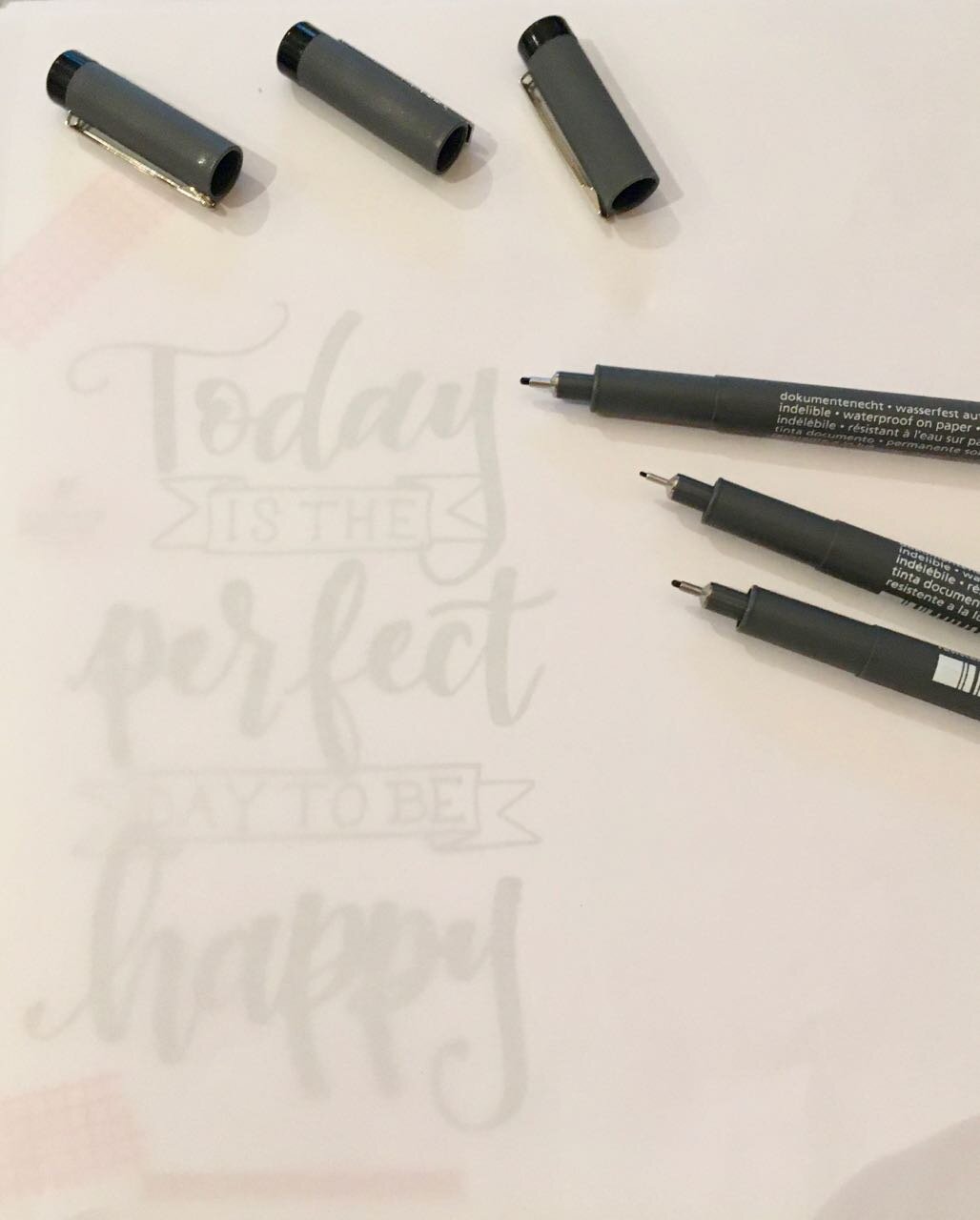
I wanted to try more though, so found another quote - Today is the perfect day to be be happy - and off I set again. I thought I’d try this one using the pigment liners, but being such a colour fan, I couldn’t bring myself to do a plain black and white version.


Overall, I’ve had a productive weekend, and a great reintroduction to lettering. I’ve done more than these two, and am already seeing improvements and bravery with the colours, but more on that another day.
And look, I even attempted to conquer my fear of Fs. Perfect (well, good enough).
* With thanks to the London Graphic Centre for providing the materials used in this post, for the purposes of this review.