An art inspired lounge

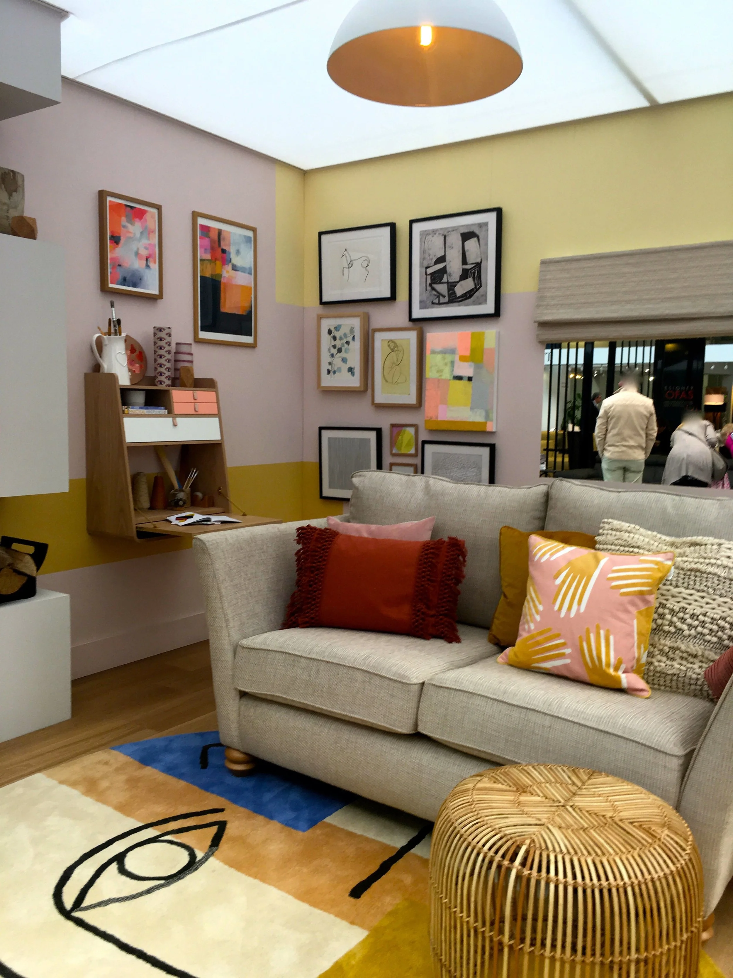
Pale green and pale pink is a great colour combination and it was great to see this at Grand Designs Live earlier in the year. There they mixed in some art and the whole room set had a feeling of art deco about it. I’m not sure about the vertical battens on the wall though.

dusky pink and pale green in the lounge room set at Grand Designs Live

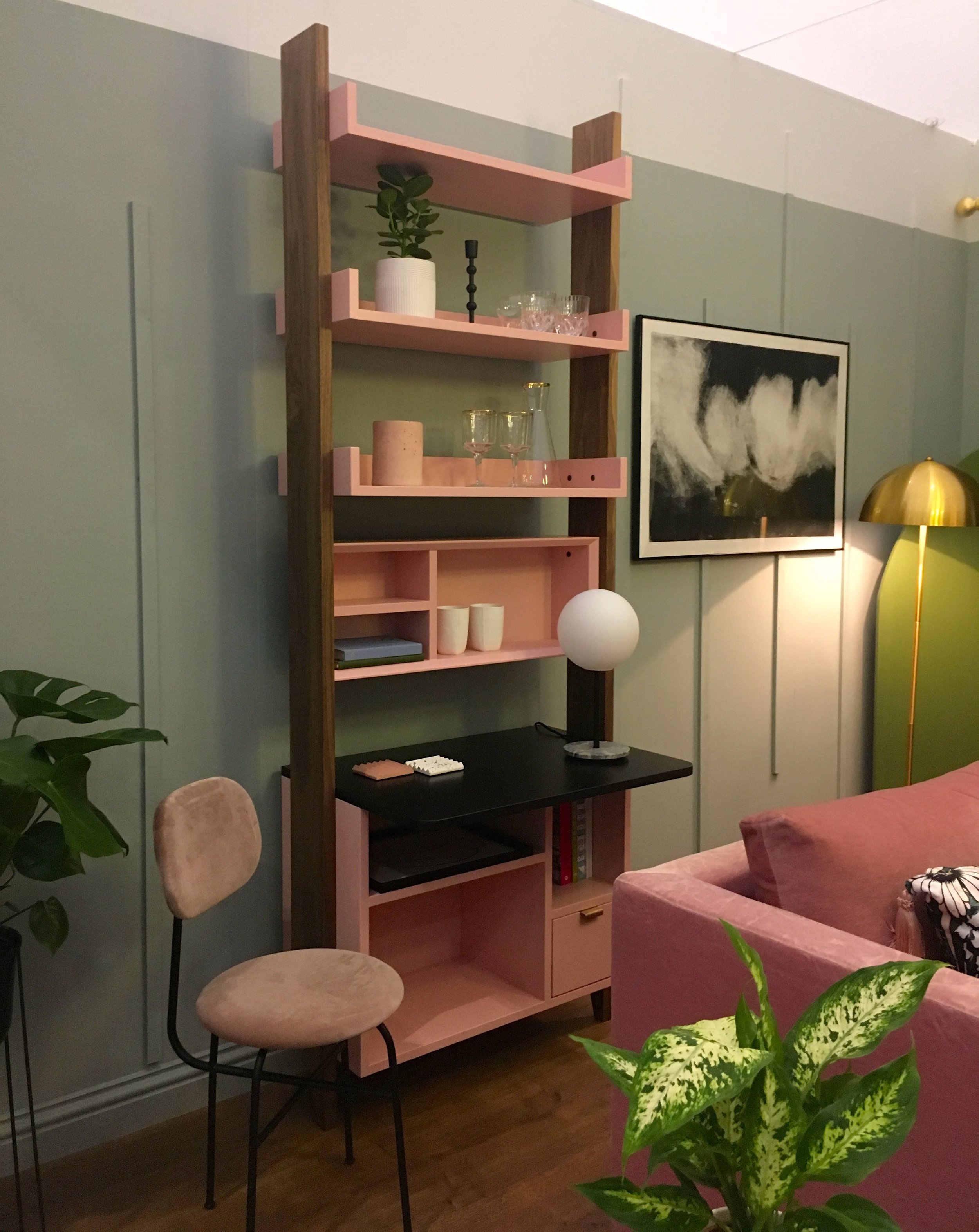
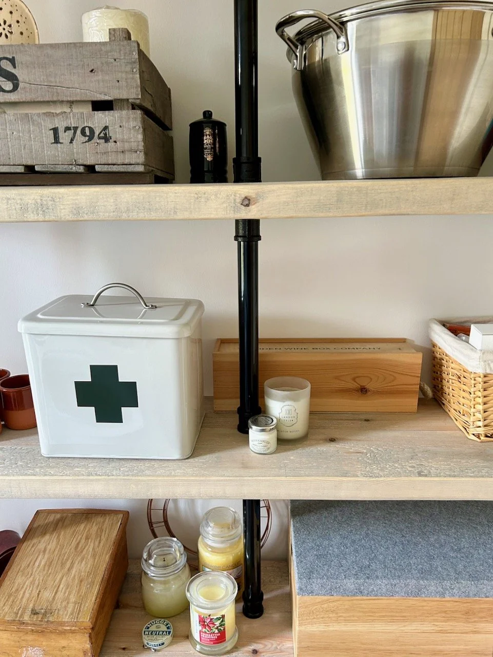
I am a fan of the freestanding boxed shelf unit, not only because it matches the room so well, but also because it’s not a uniform shape and because it’s so versatile, it could work in many rooms.

Dusky pink, prints and geometric designs

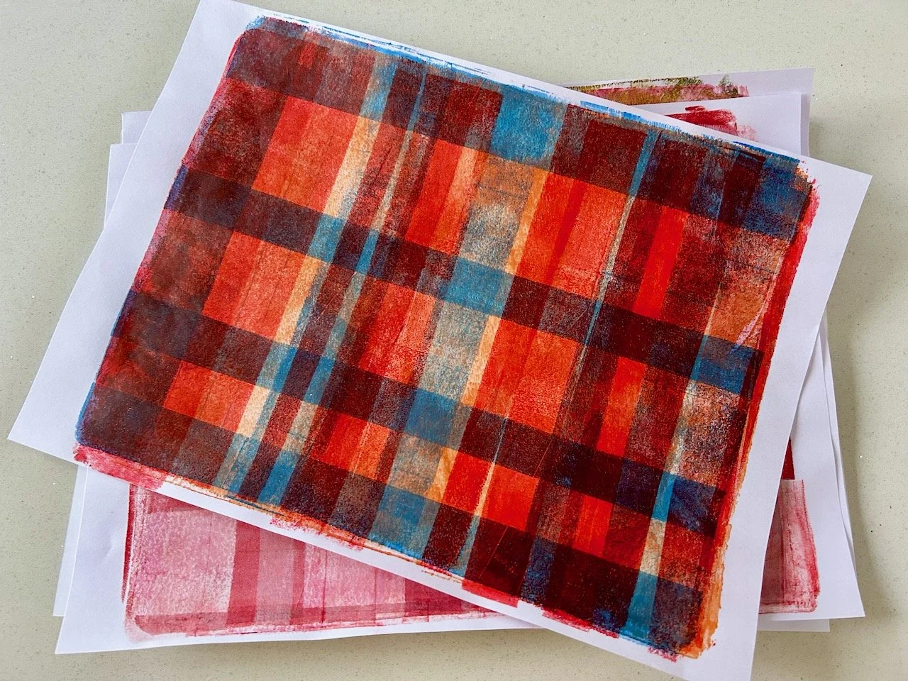
Look at the fringing on those cushions, and the screen. There’s definitely a 1920s feel, isn’t there, which is only accentuated with the geometric patterned rug.

soft furnishings in the lounge at grand designs live

I do like the lamp above the light box, it makes me smile in an unexplainable way. And (with clothes) it’d be a great fancy dress costume, and relatively easy to achieve. I have costumes on the mind at the moment as we’re off to a celebration of the First World War this coming weekend, and the dress code is of the era. After much research and looking at images on Google, I’ve realised it’s an era that isn’t as easy as it sounds, and it’s certainly not as fun (obviously) as the 1920s. For men, most often it was uniform, which is harder for MOH to source than a longish skirt, white blouse and hat that I sourced in the charity shops this weekend.

I’ve some final touches to put to the hat to dress it up a bit - I was thinking fabric flowers, and I’ve a suffragette ‘hunger strike’ medal to finish my outfit, and I’m sure I’ll share more here if I manage to make it work, and if I manage to persuade MOH to buy anything from a charity shop that he’ll actually wear. I got him to buy a flat cap, and it suits him, and I’ve a feeling he quite likes it too, but isn’t letting on too much just yet. Ideally with a brown coloured waistcoat and a neckerchief he could pass as a gardener, or similar, which is a lot easier than anything military. I’m not sure I’ll persuade him to wear wellies out on a Saturday night, but you never know…

a different angle of the room set at GDL18

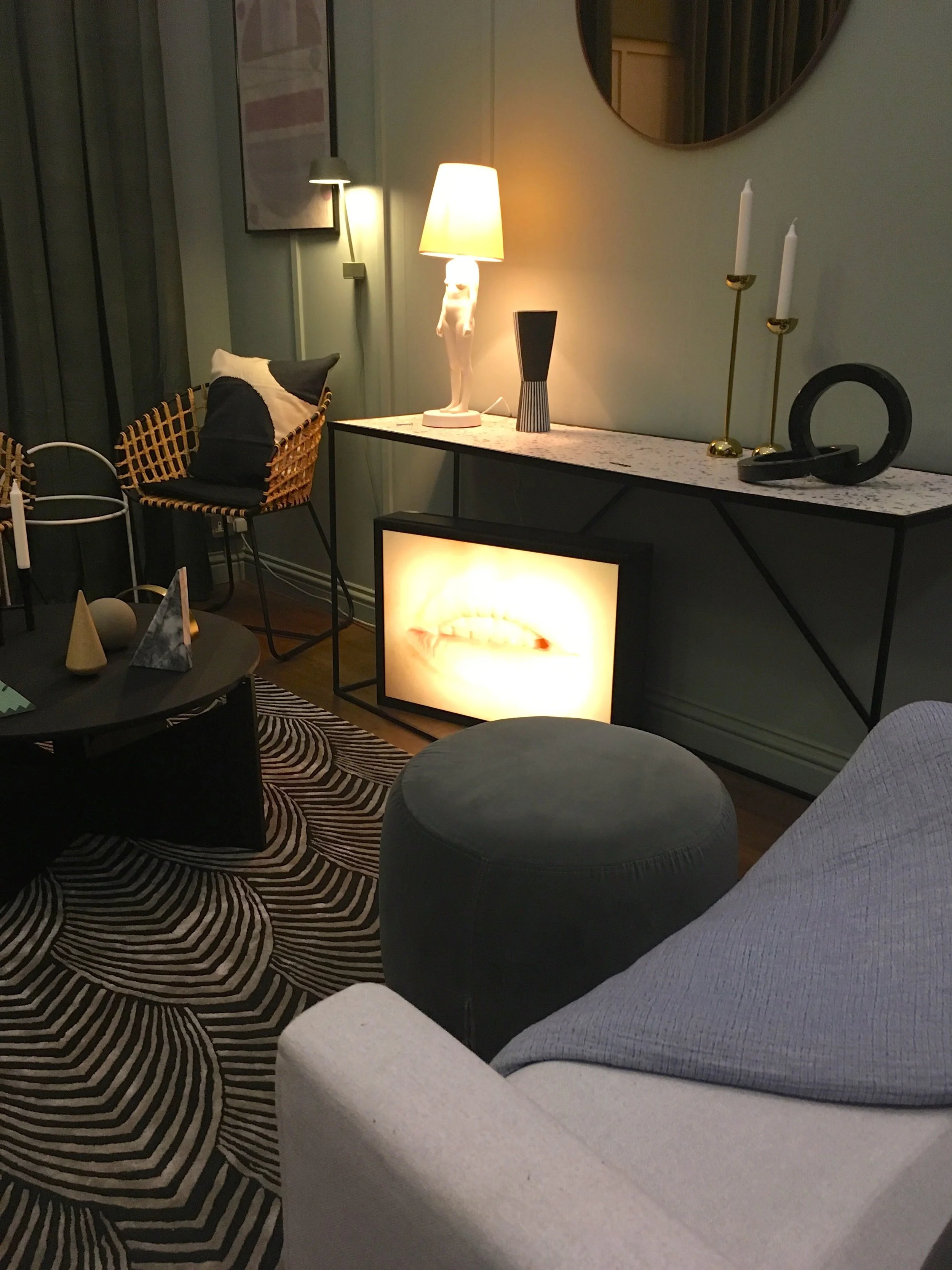
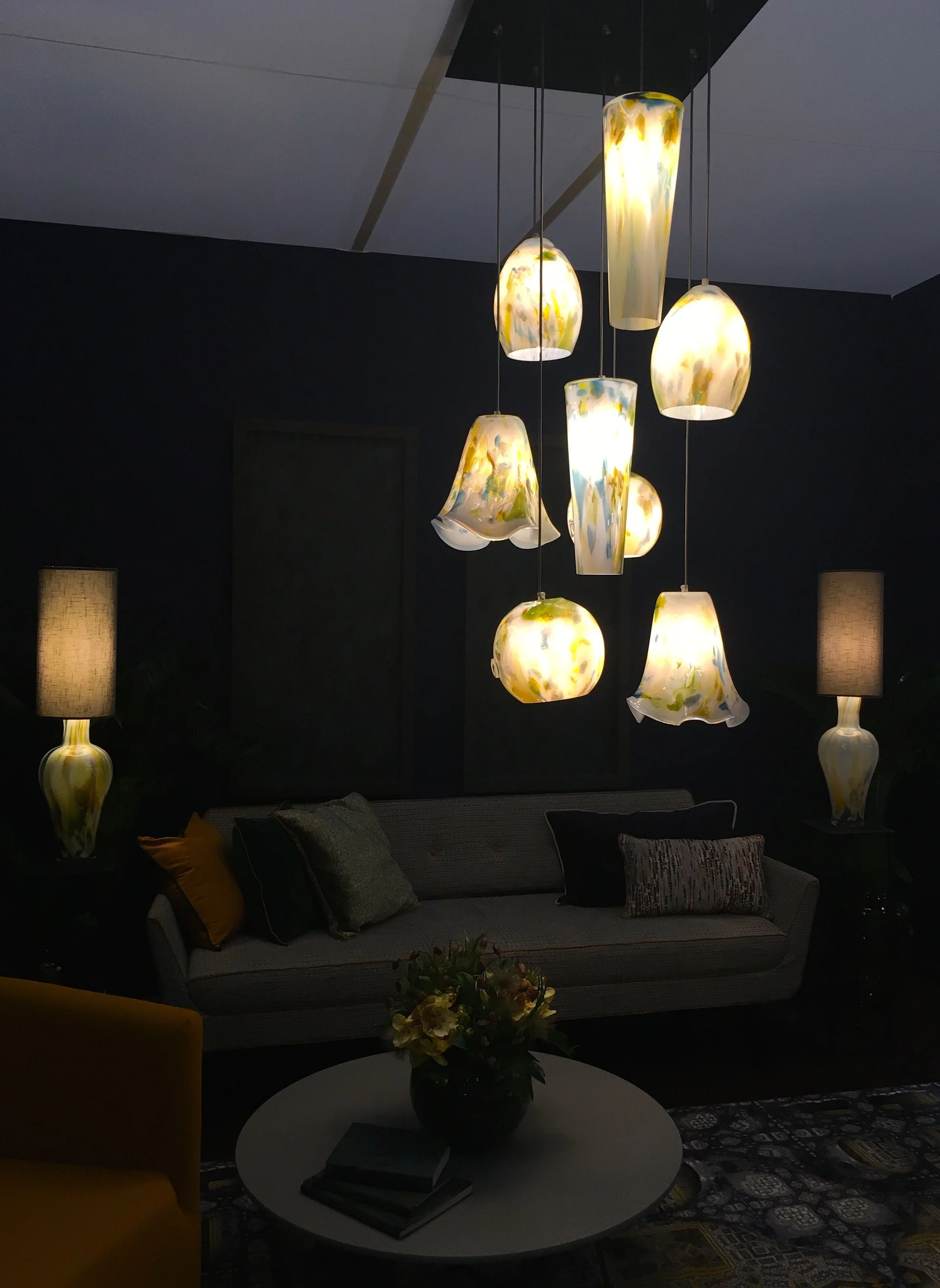
But I digress, what do you think of this room?

A dark and citrus living room

Room sets are a great way to get an idea of how colours go together, or how they might work in your own rooms without actually doing the hard work of decorating. And they’re also somewhere where you’ll find me drooling over them at the home shows, such as Grand Designs Live. At the show earlier this year, the room sets were, shall we say, provocative and often a bit marmite. The rich in colour and pattern bedroom, which I shared a while back emphasises that point, I think.

Today’s room set, a living room, is also bit more out there than those at the Ideal Home Show, which are generally (but not always) more traditional. Grand Designs Live has it’s own USP which in some ways is a bit more edgy and encourages bolder decoration, with colour - or dark walls in this case, and soft furnishings that really have some zing.

And when they said citrus, they really meant it.

A tangerine chair against a grey background with storage from the roomset at Grand Designs Live

Yes, orange, yellow and green mixed with the grey - that has citrus covered doesn’t it? Or actually perhaps the colours are tangerine, lemon and lime to be more accurate. It’s the use of those three colours together, that gives it the zing, and makes you grateful for the grey. And it’s the grey that makes it work and pulls all the brighter colours together.

A different view of the dark and citrus living room set at Grand Designs Live 2018

It’s the rug though that my eyes keep coming back to. The orange tub chairs have the zing, but the rug. Its pattern. My eyes are constantly trying to work it out. What is that pattern? What era does it come from? Is it a pattern, or just splodges? Do I like it, or am I just intrigued by it?

… so many questions, and for that last one I’m really not sure if I like it, think I should like it or don’t like it at all.

a lime green occasional chair, a patterned rug and comfy throw

There is a touch of the seventies about it isn’t there?

And maybe that’s it, maybe it reminds me of something from our first home. I remember that the living room was yellow and orange at one point, and I’m certain we also had a grey and pink carpet much later on when the walls weren’t quite so citrus. Maybe this room has a bit of everything my mind’s eye remembers from my childhood home.

Dimming the lights for effect in the room sets at Grand Designs Live

For me, the lights have a touch of murano about them too. And the matching vases.

Again that could just be reminiscing, as our first family holiday abroad was to Italy - how cosmopolitan were we?

A closer look at the table lamps

The sofa though, now I have grey sofas (many of them) but back in my childhood there was an orange one (yes really) and one finished in brown velour, but I don’t remember anything grey.

What do you think of the room set, and what evokes memories of the decor in your childhood home?

A family room, with a lot going on

I'm in two minds about this room set at this year's Ideal Home Show. I like stuff and things around me so it should be my thing, but I'm not sure if it is, and I'm not really sure why.  There's nothing in here that really offends me, but other than it having a real lived in feel, there's not much in here that really grabs me either.  

Perhaps it's fallen into that betwixt and between, and is neither one or the other - I'd be interested to know what you think after you've seen the photos. So, onto the room set.

a look at the family room at this year's ideal home show

Perhaps it's because too much of it is neutral in my opinion. But I do know that the standout item is the wall hung bureau or writing station - it reminds me of the bureau we had when growing up. The idea of closing the flap (writing table) and shutting away the office for the evening is almost completely alien to us now, now that we've developed the 'always on' mentality.  Somehow just the flap of that piece of furniture harks back to a time less frantic, peculiar hey?

a corner fireplace and walls with abstract painted shapes

It does make good use of the wall space though, there's the corner fireplace above and the wall mounted drawers below.  There's plenty of shelf space too.

Lots of momentos in the family room at the ideal home show

As I've said in previous Ideal Home posts from this year, there was often a brightly coloured armchair bringing a pop of colour, and this room set was no different.  This time orange. 

A fern, a succulent and a comfy corner to sit
A pop of colour and pompoms on the cushion (again)

And there was another pompom trimmed cushion.  I tell you, they're everywhere.

a side view of the family room at the ideal home show

So what do you think, are you smitten or a bit take it or leave it, like me?