Our space in space

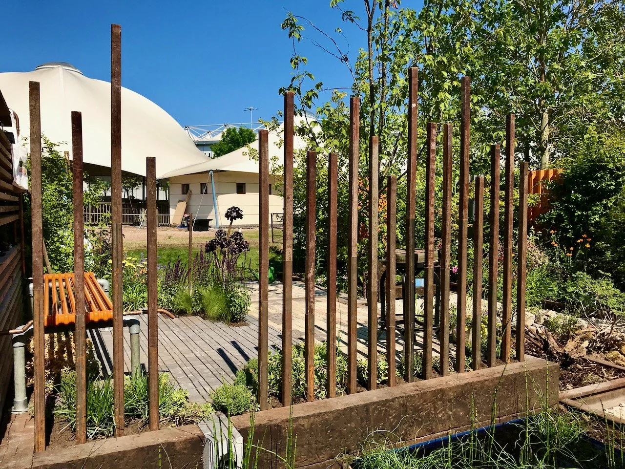
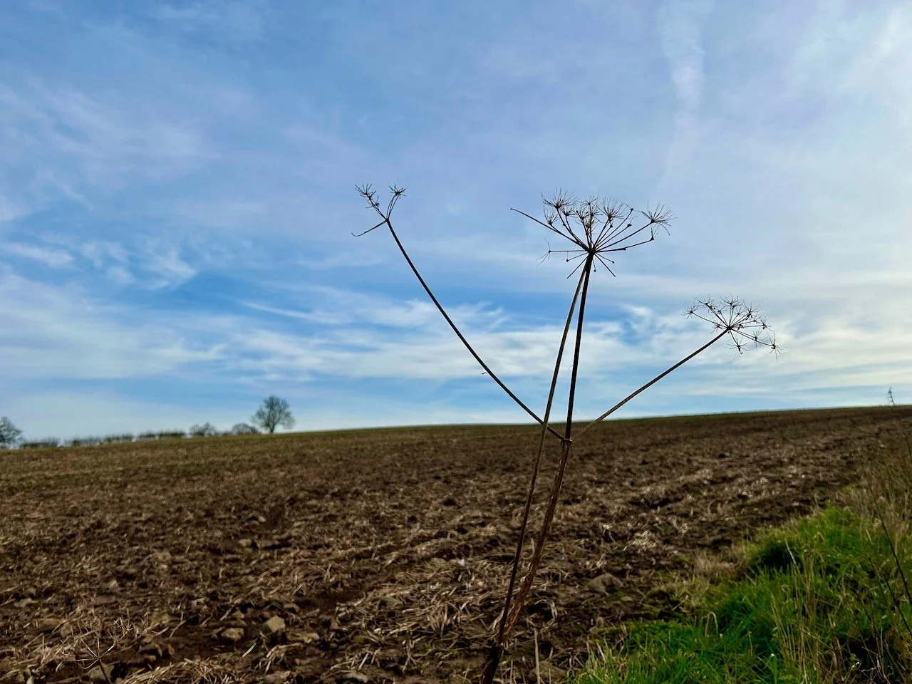
When I saw this at Gardeners' World Live I hadn't fully appreciated the concept as I have a terrible habit of taking a snap of the bumph alongside things to read later, simply enjoying the garden (or whatever) for what it is on face value at the time.  Not always a bad thing, as how often are we 'told' to live in the moment, but sometimes (and for me often afterwards) you realise the intentions had a much deeper meaning and purpose, and this Beautiful Border is one of them.

phormiums in pebbles

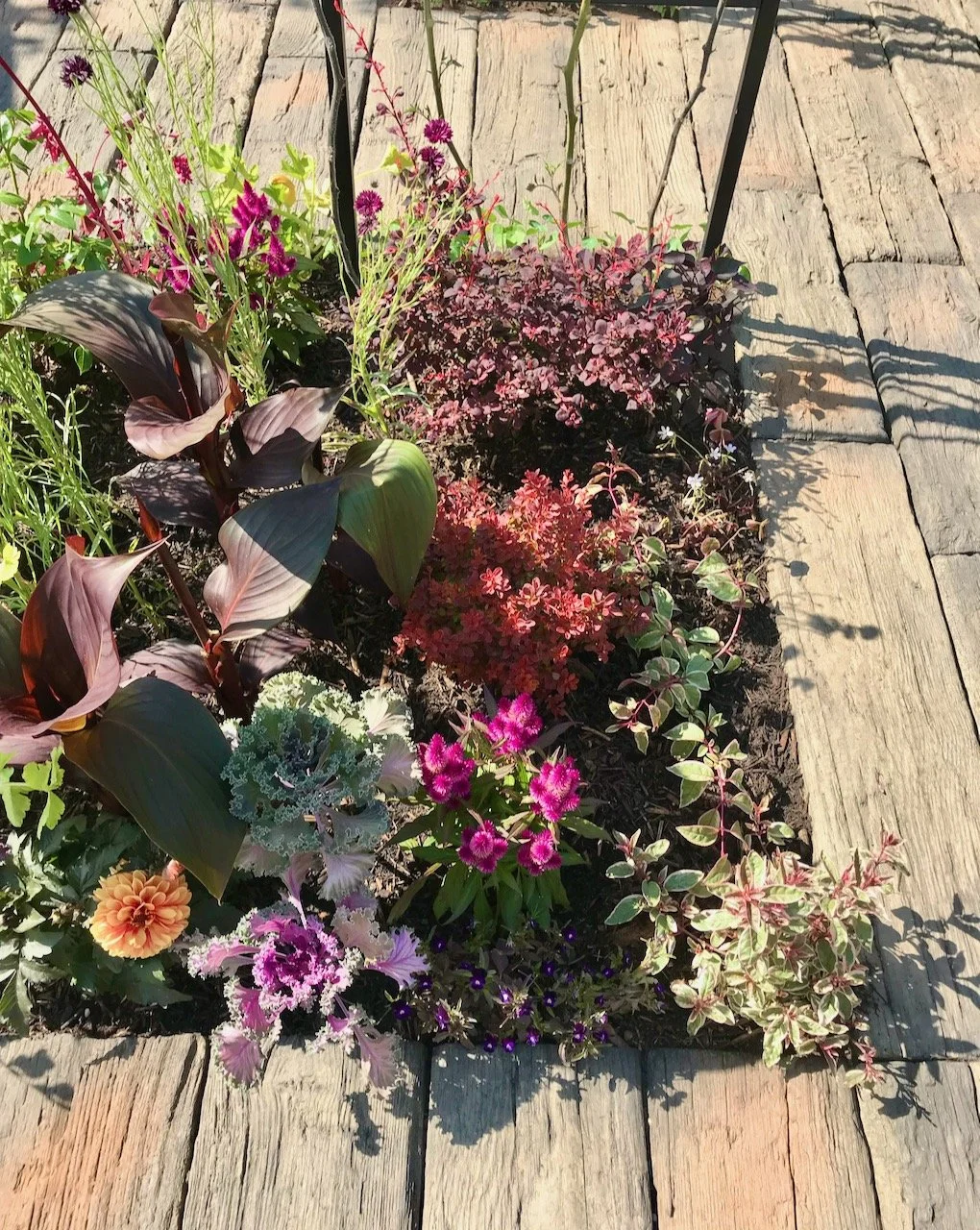
On the face of it, it's a pretty space and totally worthy of its inclusion in this part of the show, but at the time I couldn't help but notice its starkness, and stripes in comparison to the other beds.  I did spot the blue tardis though.

contrasting colours of yellow and green plants against the grey pebbles

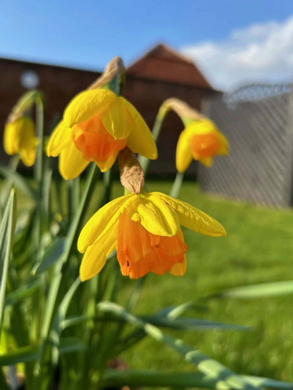
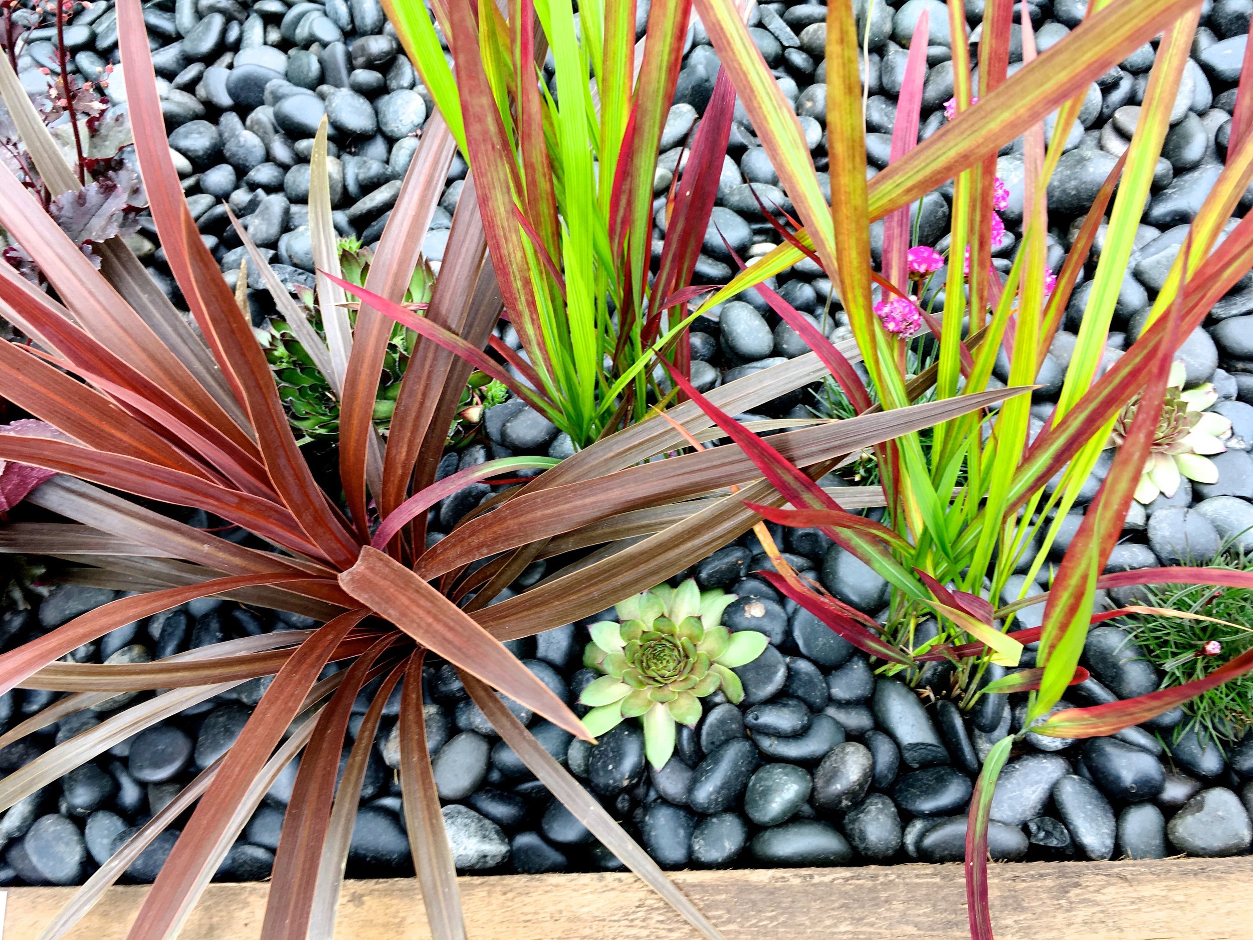
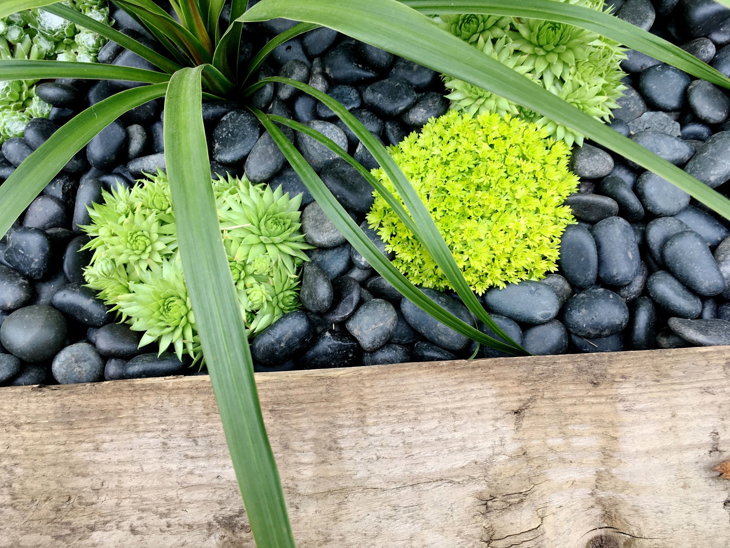
And I really enjoyed the almost lime green succulent 'balls' around the green phormium and against the grey pebbles. Striking aren't they?

A close-up of a brightly coloured succulent or two

What I hadn't realised was the greater significance of the blue dot - or tardis - and the connection to the photos taken from Voyager on 14 February 1990.

Look again at that dot.  That's here.  That's home.  That's us.

- Carl Sagan, Pale Blue Dot: A vision of the Human Future in Space

red and burgundy plants against the pebbles

Which in my book makes it a very clever - and bold - garden, which clearly works on a number of levels. And who knew that a garden could be so deep? And educative?  Certainly not me, but I'm glad it has.  Talk about inspiring. 

striking reds of the plants against the grey pebbles

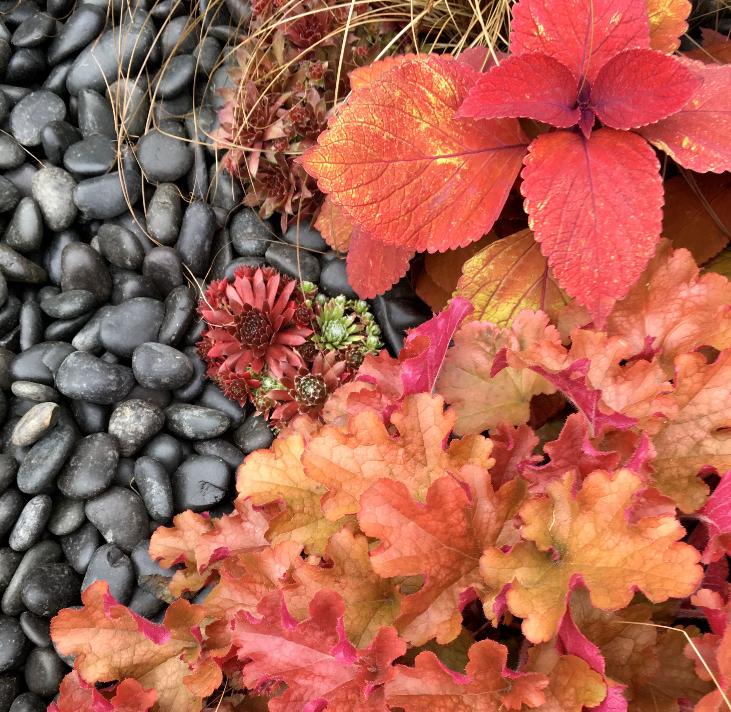
But not only on that deeper level, but also on the planting.  Just look at the succulent, and what looks to be a coleus and a heuchera with its lettuce-like leaves against the dark pebbles.  It's certainly striking, that's for sure...

PoCoLo

A map on my wall

It's been a little while since my post on loving maps, and the fear of wallpaper but the good news is the map is on the wall, and I love it.  Things didn't turn out quite as I planned for the actual putting it on the wall part, and so I didn't have to face my fear of wallpapering after all.

I was pleasantly surprised at how quickly my Wallsauce mural arrived, in fact I couldn't believe it was here just a few days after I'd made my choice, they most certainly don't hang about.  It arrived well packaged too, in a sturdy cardboard tube within a wallpaper sized cardboard box. There was wallpaper paste too, and as I discovered a visual plan as well as some written instructions, which are also available online.

THE MASTERPLAN

THE MASTERPLAN

But because life happens we needed to change our plans of tackling this ourselves. I'm certain we made the right decision as not only were we nervous wallpaperers but our attention, and time, has been taken up by those life events I mentioned on Monday, and neither of us wanted to ruin, or even slightly mess up, what is quite honestly, beautiful wallpaper.

And so we asked our conservatory builders to do the job for us, or the decorator anyway - I use builders as a generic term, and were confident they were up to the job, I wouldn't have asked otherwise.  They were just as keen as us to see what was inside the package that arrived, and so we peeked.  My first view was of Alaska (from Panel 1 of the plan above), and I was smitten, although in truth I think it could have been anywhere and I'd have had the same reaction, because as I said in my first post, because, well maps.

A peak at Alaska on the Wallsauce map mural

Now the builders had seen the wallpaper, they were keen to see the wall it was going on, which was the tricky bit, as we'd yet to tell them it was the curved wall around our spiral staircase.  Their faces were a picture, and while they might have been a little incredulous they were soon checking the wall for what prep needed to be done.

I know from dad that it's all in the preparation, so I wasn't surprised to come home to a wall with some extra filler.  Actually it was great to see tradesmen taking pride in their work, reading the instructions that came with the wallpaper, consulting with us and confident in their skills to do a job well, that we'd all be happy with.

FIRST THE FILLER, THEN THE DUST

FIRST THE FILLER, THEN THE DUST

But of course where filler goes, dust follows.  Luckily I'd thought this through and moved the duvet and as much as I could out of the room.  The room was covered with plastic sheets and dust sheets, but my reasoning was if it's not there in the first place it's not going to get dusty, is it?  And that's something I'd recommend, even if a builder says there'll be no dust.  As it's likely your definition of no dust will be different to theirs!

The result which wowed

I'd been keen to follow progress as the paper went up, and cups of tea were made, proffered and gratefully received so I could keep a bit of an eye on proceedings.  And progress was quick, relatively speaking (and definitely much quicker than I would have done) and the paper, and the design got the thumbs up from the builder too.

Even among the dust and detritus it was clear this was something spectacular.  I hadn't thought how having a map on a curved wall would give it a "globe" effect, but of course now it's been pointed out I'm going to claim that as the idea all along, what do you think?

A map on a round wall has a globe life effect

In my first post I shared my potential choices from the world map wallpaper section on the Wallsauce site, but didn't share which one I'd chosen.  This is the Antique world map and is the perfect choice for our room as it tones well with the wardrobe, and as both are things that I expect to be around for some time, that's a good thing.

the americas next to the wardrobe

The more eagle-eyed among you will have already spotted that Australia and New Zealand are missing (sorry guys!) - my wall just wasn't big enough to get you in and I chose to include all of the Americas, rather than cutting that off of the final design.  It's nothing personal, but as we're more likely to travel to the States it made sense to have that on our wall, as I'm pretty sure this wall is now going to become a key tool in our travel planning,

I wasn't expecting to be able to choose where to make the cut on the design, but thinking about it logically it makes sense as not all walls will be the same size, and not all images work if stretched to peculiar dimensions.  In fact the customisable-ness of the image size and position is one of the pluses, and imagine how this could work if you chose your own image. It was also easy to do on the site and to check your design.

You'll see that our map has a textured effect (look to the right of the text South Atlantic Ocean in the photo below) and that's in the wallpaper design rather than actually being raised, and it's very effective and I think adds to the overall result.

A wallsauce mural map on my wall

I mentioned that we would most likely use this while planning our trips, but it's already had its first use when at the weekend I looked to see where England's game against Panama was taking place in the World Cup.  You can clearly see Nizhniy Novgorod to the right of Moscow in the photo on the left below, and my light switch in China in the photo on the right.  

Checking where the England match took place at the world cup
China and the lightswitch

There's going to be many happy hours poring over this map, which has entirely transformed the room.  You've probably worked out I'm completely thrilled with it already and impressed with the quality and service I received - and I am - but I'm keen to know if you have, or would consider mural wallpaper in your house, and of course what do you think of my wall.

* This is a collaborative post but all views and opinions are my own.

PoCoLo
Home Etc

Blinds and shutters with Thomas Sanderson

No doubt like me you've heard of Thomas Sanderson and their conservatory blinds and shutters and think you know their products. I did too, but when I visited their stand at Grand Designs recently, I realised that maybe I didn't after all.

It's been a long time since I've looked at blinds, and I think it's safe to say that I've never really considered conservatory blinds.  But with the work we have going on in our conservatory at the moment I was interested to find out if conservatory blinds really could be for us. 

I was surprised to learn that Thomas Sanderson have partnered with Laura Ashley to bring two great names into your conservatory.  There's twenty two colours in this range and while I didn't see them, I'm pretty sure the colours will be classic, muted, easy to live with and coordinate easily with every kind of conservatory decor.

conservatory blinds from Thomas Sanderson

There were a couple of other things I learnt on my visit too, and it seems that blinds are no longer just blinds. I expect the design to be elegant, and functional of course, but I never expected blinds to be full of innovation and technology.

The Duette energy smart blinds have a honeycomb layer, which is where the innovation comes in.  These two layers of pleated fabric offer superior insulation, keeping conservatories warm in winter and cooler in warmer weather - clever hey?  Someone's been doing their homework on the typical UK conservatory! 

blinds from Thomas Sanderson at Grand Designs
 
blinds by Thomas Sanderson at Grand Designs

Thomas Sanderson's website says that these blinds can "reduce energy bills by up to 25%" and as well as keeping the glare out they "absorb up to 45% of noise pollution" which is quite something.

The technology I mentioned before is two-fold.  Instead of manually raising and lowering your blinds you can opt for a remote control, which was new to me.  But even newer, and only to be expected is a new app.  I told you it was clever.

IMG_6819.jpg

Shutters provide a completely different look for a conservatory and are also suitable for kitchens and bathrooms.  Thomas Sanderson have developed their LifeTime shutters to keep the heat in, to not fade or turn yellow from exposure or sunlight.  Which sounds exactly what you want, and like their blinds don't have to be boring, as the image below from the stand shows.

shutters by Thomas Sanderson

It was fascinating to learn more about modern day blinds, and both MOH and I walked away from the Thomas Sanderson stand truly inspired and wowed by the possibilities for our own conservatory. 

What's put us off even thinking about conservatories so far is thinking that blinds were fuddy-duddy, but these certainly aren't.  Another consideration we thought might make blinds a no-go is the width of our window, which is around two metres but we learnt that this shouldn't be an issue either, and the people at Thomas Sanderson's have clever ways around this too, if needed.

Since we've been back from Grand Designs we've given blinds in our conservatory some serious thought.  We are tempted but at the moment our priority is getting through this part of the refurbishment and it's something we'll come back to and give further consideration to once that's done.  The unknown though is the price, and while I understand that Thomas Sanderson is committed to craftsmanship and personal service, it would be nice to know if they're in our price range before booking a design consultation, which for me, is something I'd do once I was seriously considering taking this forward.

I know from our visit to Grand Designs that it's well worth talking to their people, not only were they well informed and knowledgeable, they were also extremely personable and proud of the company they represented.  And how a company's people operate tells you a lot about a company, I think.  So thanks to Debbs and her team at Grand Designs for making us feel so welcome, and for sharing their knowledge, it was much appreciated.


* This is a collaborative post but all views are my own.